
Three Oracle APEX widgets round off the JavaScript API. The treeView renders the Tree region and gets its data from a node adapter. The menu widget draws popup menus, menu bars, and the menus behind buttons. The iconList turns a plain list into a grid of selectable items. Knowing them lets you search and remember a tree's state, build trees and menus of your own, and wire menus to buttons with no code at all.
This guide covers all three with tested examples and their real output, and ends with two recipes: searching a tree, and keeping a tree's expanded nodes between visits.
Quick Reference
| Task | Widget and methods |
|---|---|
| Expand and collapse nodes | treeView: expand, collapse, expandAll, collapseAll, getExpandedNodeIds, getExpandedState |
| Find and select nodes | treeView: find, getTreeNode, getNodes, getSelection, setSelection, getSelectedNodes, setSelectedNodes |
| Activate and focus | treeView: focus, the activateNode event |
| Build a tree of your own | $.apex.treeView.makeDefaultNodeAdapter |
| Change a tree | treeView: addNode, moveNodes, copyNodes, deleteNodes, update, refresh, renameNodeInPlace, addNodeInPlace |
| Query and change tree data | treeNodeAdapter methods |
| Popup menus and menu bars | menu: toggle, open, find, setCurrentMenuItem, refresh, resize |
| Menu buttons | data-menu attribute |
| Selectable item lists | iconList: getSelection, getSelectionValues, setSelection, getColumns, getRows, refresh, resize, focus |
How to Run These Examples
The examples ran in Oracle APEX 26.1 on a test application. The tree examples use a Tree region of product categories with the static ID categories; the menu and icon list examples add their widgets to a page with a Recent Orders region. The output under each example is exactly what the browser console printed.
To try one, open a page of your own, press F12, paste the code into the Console tab, and replace the region IDs with your own. Several examples use await at the top level, which the console allows; inside a dynamic action, wrap such code in an async function. For building a Tree region in Page Designer, see the guide to maps, calendars, and trees in Oracle APEX.
The Tree: treeView
A Tree region is a treeView widget, and apex.region(id).widget() returns its element. Every tree example starts from it:
Getting the tree widget:
const tree$ = apex.region("categories").widget();Tree Options
| Option | Description |
|---|---|
| getNodeAdapter | A function that returns the node adapter. |
| showRoot, expandRoot, collapsibleRoot | Show a single root node, or its children as several roots; expand it at the start; allow collapsing it. |
| multiple, nodeSelector | Multiple selection, and a checkbox or radio button before each node. |
| navigation, useLinks | A navigation tree, where activating a node follows its link; nodes with links render as anchors. |
| doubleClick | false, "activate", or "toggle" (expand or collapse). |
| autoCollapse | Only one sibling can be expanded at a time. |
| keyboardAdd, keyboardDelete, keyboardRename, clickToRename | In-place editing with Insert, Delete, F2, or a click. |
| dragAndDrop, dragReorder, dragMultiple, and the other drag options | Drag and drop, with the options of jQuery UI draggable and droppable. |
| iconType, labelClass | The icon type class, and the class of the node label. |
| contextMenu, contextMenuId, contextMenuAction | A context menu. |
| allowCopy, tooltip, idPrefix, actionsContext, adapterTypesMap | Clipboard, tooltips, IDs, an actions context for navigation, and types for trees built from markup. |
Example:
const tree$ = apex.region("categories").widget();       // the treeView of the Product Categories tree
const o = (name) => tree$.treeView("option", name);
console.log({ showRoot: o("showRoot"), expandRoot: o("expandRoot"), multiple: o("multiple"), navigation: o("navigation"),
              doubleClick: o("doubleClick"), dragAndDrop: o("dragAndDrop"), nodeSelector: o("nodeSelector"),
              iconType: o("iconType"), useLinks: o("useLinks"), autoCollapse: o("autoCollapse") });
const adapter = tree$.treeView("getNodeAdapter");
const root = adapter.root();
console.log("root:", adapter.getLabel(root), "- children:", adapter.childCount(root));
const camping = adapter.child(root, 0);
console.log("first:", adapter.getLabel(camping), camping.id, adapter.getIcon(camping), "- children:", adapter.childCount(camping));
Output:
{
  "showRoot": false,
  "expandRoot": true,
  "multiple": false,
  "navigation": true,
  "doubleClick": false,
  "dragAndDrop": false,
  "nodeSelector": false,
  "iconType": "fa",
  "useLinks": true,
  "autoCollapse": false
}
root: root - children: 6
first: Camping C1 fa-folder-o - children: 4
This region is a navigation tree: showRoot is false, so its six top-level categories appear as roots, and activating a node follows its link.
expand, collapse, expandAll, collapseAll, getExpandedNodeIds, and getExpandedState
Expand and collapse a tree node, or all its descendants; with no node given, they work on the root. getExpandedNodeIds and getExpandedState return the IDs of the expanded nodes and a map of IDs to states, so you can save and restore the expansion. The tree fires expansionStateChange for each node.
Syntax:
treeView.expand([pNodeContent$])
treeView.collapse([pNodeContent$])
treeView.expandAll([pNodeContent$])
treeView.collapseAll([pNodeContent$])
treeView.getExpandedNodeIds() → string[]
treeView.getExpandedState() → object
Example:
const tree$ = apex.region("categories").widget();       // the treeView of the Product Categories tree
const log = (event, data) => console.log("expansionStateChange:", data.node.label, data.expanded ? "expanded" : "collapsed");
tree$.on("treeviewexpansionstatechange", log);
const camping$ = tree$.treeView("getTreeNode", tree$.treeView("getNodeAdapter").child(tree$.treeView("getNodeAdapter").root(), 0));
tree$.treeView("expand", camping$);
console.log("expanded:", tree$.treeView("getExpandedNodeIds"));
tree$.off("treeviewexpansionstatechange", log);
tree$.treeView("expandAll");
console.log("after expandAll:", tree$.treeView("getExpandedNodeIds").length, "nodes");
tree$.treeView("collapseAll");
tree$.treeView("expand");                                  // the root
const state = tree$.treeView("getExpandedState");
console.log("state:", Object.keys(state).length, "nodes,", Object.values(state).filter(Boolean).length, "expanded");
Output:
expansionStateChange: Camping expanded
expanded: ["C1"]
after expandAll: 24 nodes
state: 24 nodes, 6 expanded
An important distinction runs through the rest of this guide. Tree methods take tree nodes, the elements with the class a-TreeView-content, while the adapter works with nodes, the data objects. getTreeNode and getNodes convert between the two.
find, getTreeNode, and getNodes
find searches the tree for nodes that a function matches, down to a given depth (-1 for all levels), and returns the first match or, with findAll, every match as tree nodes. getTreeNode returns the tree node of a node, and getNodes returns the nodes of tree nodes.
Syntax:
treeView.find(pOptions) → jQuery
treeView.getTreeNode(pNode) → jQuery
treeView.getNodes(pNodeContent$) → node[]
| Option of find | Description |
|---|---|
| match | A function that returns true for a matching node. |
| parentNodeContent$ | Where to start. By default, the root. |
| depth | How deep to search. The default is 1; -1 means no limit. |
| findAll | Return all matches rather than the first. |
getSelection, setSelection, getSelectedNodes, and setSelectedNodes
Read and set the selection, either as tree nodes or as nodes. The tree fires selectionChange a moment later.
Syntax:
treeView.getSelection() → jQuery
treeView.setSelection(pNodeContent$, [pFocus], [pNoNotify])
treeView.getSelectedNodes() → node[]
treeView.setSelectedNodes(pNodes, [pFocus], [pNoNotify])
Example:
const tree$ = apex.region("categories").widget();       // the treeView of the Product Categories tree
tree$.treeView("expandAll");
const found$ = tree$.treeView("find", { depth: -1, match: (node) => /^(Tents|Sleeping Bags)$/.test(node.label), findAll: true });
console.log("found:", tree$.treeView("getNodes", found$).map((n) => n.label));
tree$.on("treeviewselectionchange", () => console.log("selectionChange:", tree$.treeView("getSelectedNodes").map((n) => n.label)));
tree$.treeView("setSelection", found$.first(), true);
await new Promise((resolve) => setTimeout(resolve, 200));  // the event follows a moment later
console.log("selection:", tree$.treeView("getSelection").text());
const adapter = tree$.treeView("getNodeAdapter");
tree$.treeView("setSelectedNodes", [adapter.child(adapter.root(), 1)], false, true);   // no event
await new Promise((resolve) => setTimeout(resolve, 200));
console.log("selected:", tree$.treeView("getSelectedNodes").map((n) => n.label));
Output:
found: ["Sleeping Bags", "Tents"]
selectionChange: ["Sleeping Bags"]
selection: Sleeping Bags
selected: ["Climbing"]
find only searches tree nodes that have been rendered, which is why the example expands everything first. The second selection passed pNoNotify, so it fired no event.
focus and activateNode
focus puts the focus back on the node that last had it. Activating a node, with Enter, a double click, or a click in a navigation tree, fires activateNode; in a navigation tree it also follows the node's link.
Syntax:
treeView.focus()
Example:
const tree$ = apex.region("categories").widget();
tree$.on("treeviewactivatenode", (event, data) => console.log("activateNode:", data.nodes.map((n) => n.label)));
const node$ = tree$.find(".a-TreeView-content").eq(1);
tree$.treeView("setSelection", node$, true);
node$.trigger(apex.jQuery.Event("keydown", { which: 13, keyCode: 13, key: "Enter" }));   // the user presses Enter
tree$.treeView("focus");
console.log("focus on:", document.activeElement.textContent.trim());
Output:
activateNode: ["Camp Furniture"]
focus on: Camp Furniture
The Default Node Adapter: $.apex.treeView.makeDefaultNodeAdapter
A tree gets its data from a node adapter, an object with methods such as root, child, and getLabel. The Tree region builds one from its SQL query. For a tree of your own, makeDefaultNodeAdapter builds one from a simple structure of nodes, each with label, id, type, icon, link, linkTarget, classes, isDisabled, accDescription, operations, and children. Give a node an empty children array when it could have children, and leave the property out for a node whose children load later.
Syntax:
$.apex.treeView.makeDefaultNodeAdapter(pData, [pTypes], [pHasIdentity], [pInitialExpandedNodeIds]) → treeNodeAdapter
Node types, passed as pTypes, set defaults for all nodes of a type:
| Property | Description |
|---|---|
| icon, classes, isDisabled | Defaults for nodes of the type. |
| defaultLabel | The label of new nodes. |
| validChildren | The types a node may have as children, or true for any. |
| operations | canAdd, canDelete, canRename, and canDrag, as Booleans or functions, plus drag and externalDrag, the drop operation for each modifier key. |
The type default applies to every node, and a node's own properties override its type.
addNode, moveNodes, copyNodes, deleteNodes, update, and refresh
Change the tree and its adapter's data together. addNode adds a node under a parent at an index, moveNodes and copyNodes move and copy tree nodes under another parent, and deleteNodes deletes them, each after asking the adapter whether it is allowed. After changing a node's data yourself, update redraws it; refresh redraws the tree or a subtree after larger changes; and deleteTreeNodes removes tree nodes whose data you have already deleted.
Syntax:
treeView.addNode(pToParentNodeContent$, pIndex, [pNode])
treeView.moveNodes(pToParentNodeContent$, pIndex, pNodeContent$)
treeView.copyNodes(pToParentNodeContent$, pIndex, pNodeContent$)
treeView.deleteNodes(pNodeContent$)
treeView.deleteTreeNodes(pNodeContent$)
treeView.update(pNodeContent$, [pRender])
treeView.refresh([pNodeContent$])
Example:
// A tree of your own: the default node adapter over a simple node structure.
const adapter = apex.jQuery.apex.treeView.makeDefaultNodeAdapter({
    label: "Orbit", type: "root", id: "0", children: [
        { label: "Camping", type: "category", id: "1", children: [
            { label: "Tents", type: "category", id: "11", children: [] },
            { label: "Sleeping Bags", type: "category", id: "12", children: [] }] },
        { label: "Clothing", type: "category", id: "2", children: [
            { label: "Jackets", type: "category", id: "21", children: [] }] }] },
    {                                                        // node types
        "default": { operations: { canAdd: false, canDelete: false, canRename: false, canDrag: false } },
        "root": { icon: "fa fa-home" },
        "category": { icon: "fa fa-folder-o", validChildren: ["category"],
                      operations: { canAdd: true, canDelete: true, canRename: true, canDrag: true } }
    },
    true);                                                   // the nodes have IDs
apex.jQuery(`<div id="orbit_tree"></div>`).insertBefore("#categories").treeView({
    getNodeAdapter: () => adapter, showRoot: true, expandRoot: true, multiple: true
});
const tree$ = apex.jQuery("#orbit_tree");
tree$.treeView("expandAll");
const find = (label) => {                                  // the tree node of the node with a label
    const walk = (n) => adapter.getLabel(n) === label ? n
        : Array.from({ length: adapter.childCount(n) ?? 0 }, (_, i) => walk(adapter.child(n, i))).find(Boolean);
    return tree$.treeView("getTreeNode", walk(adapter.root()));
};
const show = () => { const out = []; const walk = (n, depth) => { out.push("  ".repeat(depth) + adapter.getLabel(n));
    for (let i = 0; i < (adapter.childCount(n) ?? 0); i++) walk(adapter.child(n, i), depth + 1); }; walk(adapter.root(), 0); return out.join("\n"); };
tree$.treeView("addNode", find("Camping"), 0, { label: "Camp Kitchen", type: "category", id: "13", children: [] });
tree$.treeView("moveNodes", find("Clothing"), 0, find("Sleeping Bags"));
tree$.treeView("deleteNodes", find("Jackets"));
const tents$ = find("Tents");
tree$.treeView("getNodes", tents$)[0].label = "Tents & Shelters";   // changed in the data...
tree$.treeView("update", tents$);                                    // ...and shown
await new Promise((resolve) => setTimeout(resolve, 300));
console.log(show());
Output:
Orbit
  Camping
    Camp Kitchen
    Tents & Shelters
  Clothing
    Sleeping Bags
The default adapter keeps children sorted by label whatever index you pass: Camp Kitchen came first, and child indexes shift with every addition. So find nodes by label or ID, as the example's helper does, never by position.
renameNodeInPlace, addNodeInPlace, beginEdit, and endEdit
Rename a node, or add one, with an input field right in the tree, just as the user does with F2 and Insert. The change goes to the adapter's renameNode and addNode. The tree fires beginEdit and endEdit with the action, rename or add.
Syntax:
treeView.renameNodeInPlace(pNodeContent$)
treeView.addNodeInPlace(pParentNodeContent$, pInitialLabel, [pContext])
Example:
const adapter = apex.jQuery.apex.treeView.makeDefaultNodeAdapter(
    { label: "Orbit", id: "0", children: [{ label: "Camping", id: "1", children: [] }] },
    { "default": { operations: { canAdd: true, canRename: true, canDelete: true } } }, true);
apex.jQuery(`<div id="orbit_tree"></div>`).insertBefore("#categories").treeView({ getNodeAdapter: () => adapter, showRoot: true });
const tree$ = apex.jQuery("#orbit_tree");
tree$.on("treeviewbeginedit treeviewendedit", (event, data) => console.log(event.type, data.action));
const camping$ = tree$.treeView("getTreeNode", adapter.child(adapter.root(), 0));
tree$.treeView("renameNodeInPlace", camping$);            // an input replaces the label
const input = tree$.find("input");
input.val("Camping & Hiking").trigger(apex.jQuery.Event("keydown", { which: 13, keyCode: 13, key: "Enter" }));
await new Promise((resolve) => setTimeout(resolve, 300));
console.log("label:", adapter.getLabel(adapter.child(adapter.root(), 0)));
tree$.treeView("addNodeInPlace", tree$.treeView("getTreeNode", adapter.root()), "New Category");
tree$.find("input").trigger(apex.jQuery.Event("keydown", { which: 13, keyCode: 13, key: "Enter" }));
await new Promise((resolve) => setTimeout(resolve, 300));
console.log("children:", adapter.childCount(adapter.root()), "-", adapter.getLabel(adapter.child(adapter.root(), 1)));
Output:
treeviewbeginedit rename
treeviewendedit rename
label: Camping & Hiking
treeviewbeginedit add
treeviewendedit add
children: 2 - New Category
Tree Events
The tree's events carry the prefix treeview.
| Event | Fires when | Data |
|---|---|---|
| selectionChange | The selection changes. | |
| expansionStateChange | A node is expanded or collapsed. | node, nodeContent$, expanded |
| activateNode | Nodes are activated. | nodes |
| beginEdit, endEdit | In-place adding or renaming starts and ends. | action, node, input |
| start, drag, stop, beforeStop | Dragging nodes starts, moves, and stops. | jQuery UI data |
| activate, deactivate, over, out | A draggable from elsewhere starts, stops, enters, or leaves. | jQuery UI data |
The Node Adapter: treeNodeAdapter
A node adapter tells the treeView everything about the data. Its methods cover the shape (root, child, childCount, hasChildren); how nodes look (getLabel, getIcon, getClasses, getAccDescription, getLink, getLinkTarget, isDisabled, isHidden, renderNodeContent); what may change (allowAdd, allowDelete, allowRename, allowDrag, dragOperations); how to change it (addNode, renameNode, deleteNode, moveNodes, copyNodes, with callbacks so changes can go to a server); lazy loading (fetchChildNodes); and view state (setExpanded, isExpanded, getExpandedNodeIds, getExpandedState, getViewId, setViewId, clearViewId). Implement it yourself for data that does not fit the default adapter; otherwise use the default one and call its methods directly:
Example:
const adapter = apex.jQuery.apex.treeView.makeDefaultNodeAdapter({
    label: "Orbit", type: "root", id: "0", children: [
        { label: "Camping", type: "category", id: "1", link: "f?p=200:products", children: [] },
        { label: "Discontinued", type: "category", id: "9", isDisabled: true, classes: "is-muted", children: [] }] },
    { "default": { operations: { canAdd: false, canDelete: false, canRename: false, canDrag: false } },
      "category": { icon: "fa fa-folder-o", validChildren: true,
                    operations: { canAdd: true, canDelete: true, canRename: true, canDrag: true } } },
    true);
const root = adapter.root(), camping = adapter.child(root, 0), old = adapter.child(root, 1);
console.log("root: add", adapter.allowAdd(root, "add"), "- delete", adapter.allowDelete(root), "- rename", adapter.allowRename(root));
console.log("Camping: delete", adapter.allowDelete(camping), "- drag", adapter.allowDrag(camping), "- drag operations", adapter.dragOperations([camping]));
console.log("link:", adapter.getLink(camping), "- icon:", adapter.getIcon(camping));
console.log("Discontinued: disabled", adapter.isDisabled(old), "- classes", adapter.getClasses(old), "- hasChildren", adapter.hasChildren(old));
adapter.renameNode(camping, "Camping Gear", (node, index) => console.log("renamed:", adapter.getLabel(node), "at", index));
adapter.addNode(camping, 0, "Tents", null, (node, index) => console.log("added:", adapter.getLabel(node), "- id", node.id ?? "(none)"));
adapter.deleteNode(old, (ok) => console.log("deleted:", ok, "- children now", adapter.childCount(root)));
Output:
root: add false - delete false - rename false
Camping: delete true - drag true - drag operations {"normal":"move", "ctrl":"copy"}
link: f?p=200:products - icon: fa fa-folder-o
Discontinued: disabled true - classes is-muted - hasChildren false
renamed: Camping Gear at 0
added: Tents - id tn4
deleted: true - children now 1
Adding through the adapter directly, rather than through treeView.addNode, changes only the data; the tree shows the change after a refresh. The new node's ID, tn4, was generated because none was supplied.
Menus: menu
The menu widget renders a popup menu, such as a context menu or the menu of a button, or a menu bar, from an array of items.
| Item property | Description |
|---|---|
| type | action, toggle, radioGroup, subMenu, or separator. |
| id, label, labelKey | The item's ID for find, and its label or the key of a text message. |
| action, href, target | What an action item does: a function, or a URL. action can also be an action name, with actionContextId. |
| get, set | For toggle and radio group items: read and set the value. |
| choices | For radio group items: objects with label, value, disabled, and accelerator. |
| menu | For sub menus: an object with items. |
| icon, iconType, onIcon, offIcon, onLabel, offLabel | Icons, and a toggle's label and icon for each state. |
| disabled, hide | Booleans or functions. |
| accelerator, ariaKeyshortcut | A shortcut to display. The menu shows it but does not handle the key. |
| current | For menu bars with behaveLikeTabs: the current item. |
| Menu option | Description |
|---|---|
| items | The menu items. |
| menubar, menubarOverflow, menubarShowSubMenuIcon, behaveLikeTabs | A menu bar, with an overflow menu, sub menu arrows, and a current item that behaves like tabs. |
| asyncFetchMenu | A function that loads the items when the menu opens. |
| customContent | Custom content instead of items, for popup menus. |
| callout, slide, firstItemIsDefault | Visual options. |
| tabBehavior | What Tab does: EXIT, NEXT, or NONE. |
| useLinks, iconType, idPrefix, popupMenuLabelId, actionsContext | Links, icons, IDs, the label of a popup menu (popupMenuLabelId is new in 26.1), and actions. |
toggle, open, and find
toggle opens a closed popup menu, or closes an open one, at an element or a position; open only opens. find returns an item by ID so you can change it before the menu opens again. The menu fires beforeOpen and afterClose, and create when it is created.
Syntax:
menu.toggle(x, [y], [args])
menu.open(x, [y], [args])
menu.find(id) → menu.Item
Example:
let compact = false, sort = "DATE";
apex.jQuery(`<div id="orbit_menu"></div>`).appendTo("body").menu({
    items: [
        { type: "action", label: "Refresh", icon: "fa fa-refresh", accelerator: "Alt+R", action: () => console.log("action: refresh") },
        { type: "toggle", label: "Compact View", get: () => compact, set: (v) => { compact = v; console.log("toggle:", v); } },
        { type: "separator" },
        { type: "radioGroup", get: () => sort, set: (v) => { sort = v; console.log("radio:", v); },
          choices: [{ label: "Newest First", value: "DATE" }, { label: "Largest First", value: "TOTAL" }] },
        { type: "subMenu", label: "Export", menu: { items: [
            { type: "action", label: "CSV", action: () => console.log("export CSV") },
            { type: "action", id: "pdf", label: "PDF", disabled: true, action: () => {} }] } },
        { type: "action", label: "Help", href: "https://docs.oracle.com/en/database/oracle/apex/26.1/", target: "_blank" }
    ]
});
const menu$ = apex.jQuery("#orbit_menu");
menu$.on("menubeforeopen", () => console.log("beforeOpen"));
menu$.on("menuafterclose", (event, data) => console.log("afterClose, action taken:", data.actionTookFocus !== undefined));
const button = apex.jQuery("#recent_orders .t-Region-headerItems--buttons").append(`<button type="button" id="orbit_menu_btn" class="t-Button">Menu</button>`).find("#orbit_menu_btn");
menu$.menu("toggle", button);                              // open it below the button
console.log("find(pdf):", menu$.menu("find", "pdf").label, "- disabled:", menu$.menu("find", "pdf").disabled);
Output:
beforeOpen
find(pdf): PDF - disabled: true
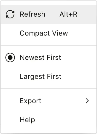
Alt+R appears beside Refresh, but the menu only displays accelerators. To make the key work, give the same command a shortcut through an action, as described in the guide to keyboard shortcuts and toolbar actions with apex.actions.
setCurrentMenuItem, refresh, and resize
For menu bars: setCurrentMenuItem marks the current item, refresh renders the bar again after its items changed, and resize adjusts the overflow after the container's width changed.
Syntax:
menu.setCurrentMenuItem(item)
menu.refresh()
menu.resize()
Example:
apex.jQuery(`<div id="orbit_menubar"></div>`).insertBefore("#recent_orders").menu({
    menubar: true, behaveLikeTabs: true, menubarOverflow: true,
    items: [
        { type: "action", id: "home", label: "Home", href: "#", current: true },
        { type: "subMenu", id: "sales", label: "Sales", menu: { items: [
            { type: "action", label: "Orders", href: "#" }, { type: "action", label: "Customers", href: "#" }] } },
        { type: "action", id: "reports", label: "Reports", href: "#" }
    ]
});
const bar$ = apex.jQuery("#orbit_menubar");
bar$.menu("setCurrentMenuItem", bar$.menu("find", "reports"));
bar$.menu("refresh");
console.log("current:", bar$.find("[aria-current=true]").text());
bar$.menu("resize");
Output:
current: Reports

For the menus and navigation bars APEX builds from lists, see the guide to navigation with lists, menus, and breadcrumbs.
Menu Buttons with data-menu
A button with data-menu="menuId" opens the popup menu with that ID when clicked, with no code needed: APEX handles the click, the position, and aria-expanded. data-menu-position="inline" opens the menu beside the button, and a link with data-hover-menu opens it on hover.
Example:
// A button with data-menu opens the menu with that ID: no code needed.
apex.jQuery(`<div id="orbit_actions_menu"></div>`).appendTo("body").menu({
    items: [{ type: "action", label: "Duplicate", action: () => console.log("duplicate") },
            { type: "action", label: "Delete", action: () => console.log("delete") }]
});
apex.jQuery("#recent_orders .t-Region-headerItems--buttons")
    .append(`<button type="button" class="t-Button" data-menu="orbit_actions_menu" aria-haspopup="menu" aria-expanded="false">Actions</button>`);
const button = apex.jQuery("[data-menu='orbit_actions_menu']");
button.trigger("click");
await new Promise((resolve) => setTimeout(resolve, 300));
console.log("menu open:", apex.jQuery("#orbit_actions_menu").is(":visible"), "- aria-expanded:", button.attr("aria-expanded"));
Output:
menu open: true - aria-expanded: true
The interactive grid's row actions menu is also a menu widget, and adding your own entry to it is one of the recipes in the guide to controlling an interactive grid with JavaScript.
The Icon List: iconList
The iconList turns a list of li elements, each with a data-value, into a grid of selectable items that works with the mouse and keyboard, as some pickers do.
| Option | Description |
|---|---|
| multiple | Several items can be selected. |
| navigation | Navigation mode, where items are activated rather than selected. It cannot change after creation. |
| itemSelector, addItemSelector | A checkbox or radio button before each item, and whether to add its markup. |
| label | How type-to-select finds an item's label. |
| tabbableContent, noNavKeyContent | Item content that is a tab stop, or that uses the arrow keys itself. |
| allowCopy, contextMenu, contextMenuId, contextMenuAction | Clipboard and context menu. |
getSelection, getSelectionValues, setSelection, getColumns, getRows, refresh, resize, and focus
Read and set the selection as elements or as data-value values. getColumns and getRows return the layout, refresh and resize update it after the items or the container changed, and focus returns focus to the last focused item. The list fires selectionchange, and activate with the values of the activated items.
Syntax:
iconList.getSelection() → jQuery
iconList.getSelectionValues() → string[]
iconList.setSelection(pItems$, [pFocus], [pNoNotify])
iconList.getColumns() → number
iconList.getRows() → number
iconList.refresh()
iconList.resize()
iconList.focus()
Example:
if (!apex.jQuery.fn.iconList) {                           // not every page loads the widget
    await new Promise((resolve) => apex.server.loadScript({ path: apex.env.APEX_FILES + "libraries/apex/minified/widget.iconList.min.js" }, resolve));
}
apex.jQuery(`<ul id="orbit_icons">
  <li data-value="tent"><span class="fa fa-home"></span> Tents</li>
  <li data-value="bag"><span class="fa fa-bed"></span> Sleeping Bags</li>
  <li data-value="jacket"><span class="fa fa-user"></span> Jackets</li>
  <li data-value="boot"><span class="fa fa-male"></span> Footwear</li>
</ul>`).insertBefore("#recent_orders").iconList({ multiple: true, itemSelector: true, addItemSelector: true });
const list$ = apex.jQuery("#orbit_icons");
list$.on("iconlistselectionchange", () => console.log("selectionchange:", list$.iconList("getSelectionValues")));
list$.on("iconlistactivate", (event, data) => console.log("activate:", data.values));
list$.iconList("setSelection", list$.children().slice(1, 3), true);
await new Promise((resolve) => setTimeout(resolve, 200));
console.log("selection:", list$.iconList("getSelection").map((i, li) => li.textContent.trim()).get());
console.log("columns:", list$.iconList("getColumns"), "- rows:", list$.iconList("getRows"));
list$.iconList("getSelection").first().trigger(apex.jQuery.Event("keydown", { which: 13, keyCode: 13, key: "Enter" }));
await new Promise((resolve) => setTimeout(resolve, 200));
Output:
selectionchange: ["bag", "jacket"]
selection: ["Sleeping Bags", "Jackets"]
columns: 15 - rows: 1
activate: ["bag", "jacket"]

Not every page loads the iconList widget, so the example loads its file first with apex.server.loadScript when it is missing. Pressing Enter on a selected item activated the whole selection, which is why both values arrived with the activate event.
Recipes
Search a Tree
A tree of a hundred categories and products is hard to scan by eye. This search collapses the tree, expands the path to every node whose name contains the text, and selects the first match. find returns tree nodes, and their ancestor elements are the nodes to expand.
Put the function in the page's Function and Global Variable Declaration attribute, and call it from a dynamic action on the Input event of a search field with searchTree(this.triggeringElement.value). For a large tree, debounce the call with apex.util.debounce, covered in the guide to apex.util templates, escaping, and debounce.
Example:
// === Page › Function and Global Variable Declaration ===
// Shows the categories whose names contain the text: collapses the tree, expands the path to
// each match, and selects the first match.
function searchTree(text) {
    const tree$ = apex.region("categories").widget();
    tree$.treeView("expandAll");                                  // so that find sees every node
    const matches$ = text ? tree$.treeView("find", {
        depth: -1, findAll: true,
        match: (node) => node.label.toLowerCase().includes(text.toLowerCase())
    }) : $();
    tree$.treeView("collapseAll");
    matches$.each((i, content) => {
        // expand every ancestor, from the top down
        $(content).parents(".a-TreeView-node").get().reverse().slice(0, -1).forEach((node) =>
            tree$.treeView("expand", $(node).children(".a-TreeView-content")));
    });
    tree$.treeView("setSelection", matches$.first(), true);      // and focus it
    return tree$.treeView("getNodes", matches$).map((node) => node.label);
}
// === Try it: search for "bag" ===
console.log("found:", searchTree("bag"));
const expanded = apex.region("categories").widget().treeView("getExpandedNodeIds");
console.log("expanded:", expanded.length, "nodes");
Output:
found: [
  "Sleeping Bags",
  "Campfire Synthetic Bag",
  "Kids Explorer Sleeping Bag",
  "Nightfall 0° Down Bag",
  "Nightfall 20° Down Bag",
  "Silk Sleeping Bag Liner",
  "Chalk Bag"
]
expanded: 4 nodes

find only searches rendered tree nodes, which is why the function expands everything first and then collapses it again. The tree allows one selected node here; with the multiple option on, setSelection would select every match.
Keep a Tree's Expanded Nodes Between Visits
Users tend to open the same branches every time. This code saves the IDs of the expanded nodes in local storage whenever a node is expanded or collapsed, and expands them again when the page loads.
Put the code in the page's Execute when Page Loads attribute. The part after "--- after the page loads ---" demonstrates it by expanding two branches and reloading.
Example:
// === Page › Execute when Page Loads ===
// The tree opens with the nodes expanded that the user had expanded on the last visit.
const tree$ = apex.region("categories").widget();
const prefs = apex.storage.getScopedLocalStorage({ prefix: "categories", usePageId: true });
const saved = JSON.parse(prefs.getItem("expanded") || "null");
const byId = (id) => tree$.treeView("find", { depth: -1, match: (node) => node.id === id });
if (saved) {
    tree$.treeView("expandAll");                               // render every node, then
    tree$.treeView("collapseAll");                             // start from a collapsed tree
    for (const id of saved) {                                  // parents come before children
        tree$.treeView("expand", byId(id));
    }
}
tree$.on("treeviewexpansionstatechange", () =>
    prefs.setItem("expanded", JSON.stringify(tree$.treeView("getExpandedNodeIds"))));
// --- after the page loads ---
// === Try it: expand Hiking and Backpacks, then come back to the page ===
const tree$ = apex.region("categories").widget();
const find = (match) => tree$.treeView("find", { depth: -1, match });
const expandedLabels = () => tree$.treeView("getExpandedNodeIds")
    .map((id) => tree$.treeView("getNodes", find((node) => node.id === id))[0].label).join(", ");
tree$.treeView("collapseAll");
for (const label of ["Hiking", "Backpacks"]) {
    tree$.treeView("expand", find((node) => node.label === label));
}
console.log("before:", expandedLabels());
location.reload();
// --- on the next page ---
const tree = apex.region("categories").widget();
console.log("after: ", tree.treeView("getExpandedNodeIds").map((id) => tree.treeView("getNodes",
    tree.treeView("find", { depth: -1, match: (node) => node.id === id }))[0].label).join(", "));
Output:
before: Hiking, Backpacks
after:  Hiking, Backpacks
getExpandedNodeIds lists parents before their children, so each node's parent is already expanded by the time its turn comes. Without this code, the tree opens collapsed after every reload. The scoped storage used here is covered in the guide to saving data in the browser with apex.storage.
Conclusion
The treeView renders a tree from a node adapter. It expands, collapses, finds, selects, and activates nodes, and adds, moves, copies, deletes, and renames them through the adapter, always working with tree nodes while the adapter works with data nodes. makeDefaultNodeAdapter turns a simple node structure and a set of types into an adapter, and keeps children sorted by label. The menu widget renders popup menus and menu bars from five item types, and a data-menu attribute turns any button into a menu button with no code. The iconList makes a list of items selectable with mouse and keyboard. Together with getExpandedNodeIds and local storage, these pieces make trees that users can search and that remember how they left them.
