
An interactive grid in Oracle APEX draws its data with three view widgets. The grid widget is the familiar spreadsheet-like grid view. The tableModelView renders records with templates, and powers the cards region and the grid's icon and detail views. The recordView shows one record as a form, which is the grid's single row view. Going one level below the interactive grid to these widgets gives you control over columns, cell selection, fill and copy down, the active row while editing, and even lets you build selectable lists of your own.
This guide covers all three widgets with tested examples and their real output, and ends with two recipes: coloring rows by their values, and showing fewer columns on a phone.
Quick Reference
| Task | Widget and methods |
|---|---|
| Read and change grid options | grid "option" |
| Change columns | getColumns, hideColumn, showColumn, moveColumn, setColumnWidth, freezeColumn, unfreezeColumn |
| Redraw | refreshColumns, refresh, resize |
| Select rows | getSelectedRecords, setSelectedRecords, getSelection, setSelection, selectAll |
| Select cells, fill, copy down | getSelectedRanges, setSelectedRanges, fillSelection, copyDownSelection |
| Move the current cell | getCurrentCell, setCurrentCell, gotoCell, getColumnForCell |
| Edit mode and the active row | setEditMode, inEditMode, getActiveRecord, getActiveRecordId, getActiveCellFromColumnItem, setActiveRecordValue, finishEditing, lockActive, unlockActive |
| Page through rows | getPageInfo, nextPage, gotoPage, and the other paging methods |
| Build a list from a model | tableModelView |
| Work with the single row view | recordView: getRecord, getFields, fieldElement, gotoField, setEditMode, getActions, getToolbar |
How to Run These Examples
The examples ran in Oracle APEX 26.1 on an editable interactive grid of stores with the static ID stores. The output under each example is exactly what the browser console printed.
To try one, open a page with an interactive grid, press F12, paste the code into the Console tab, and replace stores and the column names with your own. Several examples use await at the top level, which the console allows; inside a dynamic action, wrap such code in an async function.
How These Widgets Work
The three are jQuery UI widgets. You create one with $(element).grid(options), call a method with $(element).grid("method", args), and read or change an option with $(element).grid("option", name, value). Their events carry the widget name as a prefix: gridselectionchange, tablemodelviewselectionchange, recordviewrecordchange.
In an interactive grid, the grid widget is the view$ property of the grid view. Every grid example below starts from it:
Getting the grid widget:
const grid$ = apex.region("stores").call("getViews", "grid").view$;The views, their models, and the grid-level methods above these widgets are covered in the guide to controlling an interactive grid with JavaScript.
Options Shared by the Grid and Table Model View
grid and tableModelView share a base widget, tableModelViewBase, with these common options:
| Option | Description |
|---|---|
| modelName | Required. The ID of the model to show, which must already exist. |
| editable | The view allows editing, provided the model does too. |
| autoAddRecord | Add a record automatically when the model is empty. |
| hideDeletedRows | Remove deleted records at once instead of marking them. |
| pagination | scroll (scroll paging, the default) or page buttons; virtual renders only the rows near the viewport; loadMore adds a Load More button; plus showPageLinks, maxLinks, showPageSelector, showRange, firstAndLastButtons, and hideSinglePage. |
| rowsPerPage | Records per page, when not scrolling. |
| persistSelection | Keep the selection in the model's metadata. |
| loadIncompleteSelection | What to do when the selection includes records not fetched yet. |
| footer, hideEmptyFooter, stickyFooter, stickyTop | The footer with status and paging, and sticky header and footer. |
| hasSize, fixedRowHeight | The container has a fixed height; all rows are the same height. |
| entityTitleSingular, entityTitlePlural | What the records are called in status messages, as in "2 orders selected". |
| selectionStatusMessageKey, updateStatus | The text message key for the selection count, or a function that shows the status yourself. |
| noDataMessage, noDataIcon, showNullAs | What to show when there is no data, and for null values. |
| highlights | Highlight rules, each with an ID, seq, row, color, background, and cssClass. |
| applyTemplateOptions, progressOptions | Options for apex.util.applyTemplate and for the spinner. |
The shared paging methods, getModel, getPageInfo, firstPage, previousPage, nextPage, lastPage, gotoPage, loadMore, and fetchAllData, work as they do for the cards region, described in the guide to selecting rows and paging through reports and cards. The shared editing methods are described with the grid below.
The Grid Widget
Grid Options
| Option | Description |
|---|---|
| columns | The column definitions: an array holding one object of column names mapped to definitions. |
| columnGroups | Heading groups, with heading, headingAlignment, and parentGroupName. |
| rowHeader | The row header: none, plain, sequence (row numbers), or label (from rowHeaderLabelColumn). rowHeaderCheckbox adds selection checkboxes, and rowHeaderWidth sets the width. |
| multiple, selectAll | Allow several rows to be selected, and select all with Ctrl+A or the header checkbox. |
| selectCells, multipleCells, multipleRanges, selectCellsColumn, selectCellsRow | Cell selection instead of row selection: ranges, several ranges, and whole columns and rows. multipleRanges, selectCellsColumn, and selectCellsRow are new in 26.1. |
| allowSelectHidden | Hidden rows, in collapsed control breaks, can be selected. |
| selectionStateItem | A page item that receives the selected record IDs. |
| allowEditMode, allowInsert, allowDelete | Keyboard and mouse control: enter edit mode, Insert a row, Delete a row. |
| allowCopy, allowCut, allowPaste | Clipboard operations. allowCut and allowPaste are new in 26.1. |
| skipReadonlyCells, tabbableCellContent | Tab skips read-only cells in edit mode; content that is a tab stop in navigation mode. |
| columnSort, columnSortMultiple | Sorting from the headings. The grid only reports it through sortchange; the model and server do the sorting. |
| reorderColumns, resizeColumns | Reordering and resizing from the headings. |
| collapsibleControlBreaks | Control breaks can be collapsed. |
| aggregateLabels, aggregateTooltips | Labels and tooltips of aggregate rows. |
| contextMenu, contextMenuId, contextMenuAction | A context menu. |
| tooltip | A jQuery UI tooltip for cells. |
| constrainNavigation | Keep the arrow keys from scrolling the page. |
Each column definition has these properties:
| Property | Description |
|---|---|
| heading, label, headingAlignment, alignment | The heading (may contain markup), the plain label, and alignment. |
| seq, width, noStretch, frozen, hidden, canHide | Order, minimum width, stretching, freezing, and visibility. |
| elementId | The column item that edits the column. |
| readonly, isRequired, virtual, noCopy | Editing, and whether copy down and fill skip the column. |
| cellTemplate, escape, columnCssClasses, cellCssClassesColumn, headingCssClasses | Rendering: a template, escaping, and classes. |
| linkTargetColumn, linkText, linkAttributes | Link columns. |
| groupName, useGroupFor | The column group. |
| canSort, sortDirection, sortIndex, controlBreakDirection, controlBreakIndex | Sort and control break state, set by the server. |
| usedAsRowHeader, helpid, copyValueToClipboard, noHeaderActivate | Accessibility, help, clipboard, and header activation. |
In an interactive grid, set grid options with defaultGridViewOptions in the Initialization JavaScript Function, or change them at runtime as this example does:
Example:
const grid$ = apex.region("stores").call("getViews", "grid").view$;   // the grid widget of the Stores grid
const o = (name) => grid$.grid("option", name);
console.log({ editable: o("editable"), rowHeader: o("rowHeader"), rowHeaderCheckbox: o("rowHeaderCheckbox"),
              multiple: o("multiple"), selectCells: o("selectCells"), persistSelection: o("persistSelection"),
              columnSort: o("columnSort"), reorderColumns: o("reorderColumns"), showNullAs: o("showNullAs") });
console.log("pagination:", o("pagination"));
grid$.grid("option", "rowHeader", "sequence");            // row numbers instead of check boxes
await new Promise((resolve) => setTimeout(resolve, 300));
console.log("row headers:", grid$.find("tbody th").slice(0, 5).map((i, th) => th.textContent.trim()).get().join(" "));
Output:
{
  "editable": true,
  "rowHeader": "plain",
  "rowHeaderCheckbox": true,
  "multiple": true,
  "selectCells": false,
  "persistSelection": true,
  "columnSort": true,
  "reorderColumns": true,
  "showNullAs": ""
}
pagination: {
  "scroll": true,
  "virtual": true,
  "loadMore": false,
  "showPageLinks": false,
  "maxLinks": 5,
  "showPageSelector": false,
  "showRange": true,
  "firstAndLastButtons": false,
  "hideSinglePage": false
}
row headers: 1 2 3 4 5
getColumns, hideColumn, showColumn, moveColumn, setColumnWidth, freezeColumn, and unfreezeColumn
getColumns returns the column definitions in their current order. The other methods change a column and render the grid again. moveColumnGroup moves a column group at a given level.
Syntax:
grid.getColumns() → object[]
grid.hideColumn(pColumn)
grid.showColumn(pColumn)
grid.moveColumn(pColumn, pNewPosition)
grid.moveColumnGroup(pLevel, pOriginalPosition, pNewPosition)
grid.setColumnWidth(pColumn, pWidth)
grid.freezeColumn(pColumn)
grid.unfreezeColumn(pColumn)
Example:
const grid$ = apex.region("stores").call("getViews", "grid").view$;   // the grid widget of the Stores grid
const show = () => grid$.grid("getColumns").filter((c) => !c.hidden).map((c) => c.property).join(" ");
console.log(grid$.grid("getColumns").filter((c) => !c.property.startsWith("APEX$")).slice(0, 3).map((c) => ({ name: c.property, heading: c.heading, width: c.width, seq: c.seq })));
grid$.grid("hideColumn", "COUNTRY");
grid$.grid("moveColumn", "CITY", 0);
grid$.grid("setColumnWidth", "STORE_NAME", 300);
grid$.grid("freezeColumn", "STORE_NAME");
console.log("visible:", show());
const nameColumn = grid$.grid("getColumns").find((c) => c.property === "STORE_NAME");
console.log("STORE_NAME:", { width: nameColumn.width, frozen: nameColumn.frozen });
grid$.grid("showColumn", "COUNTRY");
grid$.grid("unfreezeColumn", "STORE_NAME");
Output:
[
  {
    "name": "ID",
    "seq": 2
  },
  {
    "name": "STORE_NAME",
    "heading": "Store",
    "seq": 3
  },
  {
    "name": "CITY",
    "heading": "City",
    "seq": 4
  }
]
visible: CITY APEX$ROW_ACTION STORE_NAME STATE OPENED_ON FLOOR_AREA_SQFT FLAGSHIP
STORE_NAME: {"width":300, "frozen":true}
In an interactive grid, the column changes a user makes are saved with the report, but changes made with these methods are not, unless you save the report afterwards.
refreshColumns, refresh, and resize
After changing column definitions yourself, call refreshColumns and then refresh, which renders the grid from the model. resize adjusts the grid to a container that changed size. debugCellEdit(true) keeps a cell's editor in the cell after it loses focus, which helps item plug-in developers inspect its styles.
Syntax:
grid.refreshColumns()
grid.refresh([pFocus])
grid.resize()
grid.debugCellEdit(pValue)
Example:
const grid$ = apex.region("stores").call("getViews", "grid").view$;   // the grid widget of the Stores grid
const columns = grid$.grid("getColumns");
columns.find((c) => c.property === "CITY").heading = "Town";   // changed outside the grid
grid$.grid("refreshColumns");
grid$.grid("refresh");
await new Promise((resolve) => setTimeout(resolve, 300));
console.log("heading:", grid$.find("thead th").filter((i, th) => th.textContent.trim() === "Town").length > 0);
grid$.grid("resize");
grid$.grid("fetchAllData");
grid$.grid("debugCellEdit", true);                       // item plug-in developers: keep editors in cells
Output:
heading: true
getSelectedRecords, setSelectedRecords, getSelection, setSelection, and selectAll
Read and set the selected rows, either as records or as row elements. setSelectedRecords returns how many rows it selected, and selectAll selects every row. The grid fires selectionchange.
Syntax:
grid.getSelectedRecords() → Record[]
grid.setSelectedRecords(pRecords, [pFocus], [pNoNotify]) → number
grid.getSelection() → jQuery[]
grid.setSelection(pRows, [pFocus], [pNoNotify])
grid.selectAll([pFocus], [pNoNotify])
Example:
const grid$ = apex.region("stores").call("getViews", "grid").view$;   // the grid widget of the Stores grid
const model = grid$.grid("getModel");
grid$.on("gridselectionchange", () => console.log("selectionchange:", grid$.grid("getSelectedRecords").length, "row(s)"));
grid$.grid("setSelectedRecords", [model.getRecord("2"), model.getRecord("7")]);
await new Promise((resolve) => setTimeout(resolve, 200));
console.log("rows:", grid$.grid("getSelection").map((row$) => row$.find("td").eq(1).text()));
grid$.grid("setSelection", grid$.find("tbody tr").slice(0, 1), false, true);   // the first row, no event
console.log("records:", grid$.grid("getSelectedRecords").map((r) => model.getValue(r, "CITY")));
grid$.grid("selectAll");
await new Promise((resolve) => setTimeout(resolve, 200));
Output:
selectionchange: 2 row(s)
rows: ["Orbit Chicago River North", "Orbit Boulder Pearl Street"]
records: ["Denver"]
selectionchange: 13 row(s)
The rows came back in grid order, Chicago before Boulder, even though the records were passed the other way round. The second selection passed pNoNotify, so it fired no event.
getSelectedRanges, setSelectedRanges, fillSelection, and copyDownSelection
With selectCells on, the selection is made of cell ranges, each written as {startRowIndex, startColIndex, endRowIndex, endColIndex} with zero-based indexes; getSelectedRanges adds the record and column keys. getSelectedRanges and setSelectedRanges are new in 26.1. fillSelection writes a value into the selected cells of some columns, and copyDownSelection copies the first row's values down; these are the Fill and Copy Down entries of the interactive grid. Both need edit mode, respect read-only cells, and update the model a moment after the call. getSelectedRange, for a single range, is deprecated.
Syntax:
grid.getSelectedRanges() → Range[]
grid.setSelectedRanges(pRanges, [pFocus], [pNoNotify])
grid.fillSelection(pFillValue, [pColumns], [pCallback]) → boolean
grid.copyDownSelection([pColumns], [pCallback]) → boolean
Example:
const grid$ = apex.region("stores").call("getViews", "grid").view$;   // the grid widget of the Stores grid
const model = grid$.grid("getModel");
grid$.grid("setEditMode", true);
grid$.grid("option", { selectCells: true });             // cell range selection
grid$.grid("setSelectedRanges", [{ startRowIndex: 0, startColIndex: 2, endRowIndex: 2, endColIndex: 3 }]);
console.log("ranges:", grid$.grid("getSelectedRanges"));
console.log("cells:", grid$.grid("getSelection").map((row$) => row$.map((i, td) => td.textContent).get().join(" | ")));
grid$.grid("fillSelection", "Colorado", ["STATE"]);        // fill STATE of the selected rows
await new Promise((resolve) => setTimeout(resolve, 300));   // the grid writes the model a moment later
console.log("STATE:", [0, 1, 2].map((i) => model.getValue(model.recordAt(i), "STATE")));
grid$.grid("copyDownSelection", ["CITY"]);                // copy the first row's CITY down
await new Promise((resolve) => setTimeout(resolve, 300));
console.log("CITY:", [0, 1, 2].map((i) => model.getValue(model.recordAt(i), "CITY")));
model.revertRecords([0, 1, 2].map((i) => model.recordAt(i)));
Output:
ranges: [
  {
    "startRowIndex": 0,
    "startRowKey": "1",
    "startColIndex": 2,
    "startColKey": "CITY",
    "endRowIndex": 2,
    "endRowKey": "7",
    "endColIndex": 3,
    "endColKey": "STATE"
  }
]
cells: ["Denver | Colorado", "Seattle | Washington", "Chicago | Illinois"]
STATE: ["Colorado", "Colorado", "Colorado"]
CITY: ["Denver", "Denver", "Denver"]
The example waits after each call before reading the model, because the grid writes the values a moment later. It ends by reverting the three records, so nothing is saved.
getCurrentCell, setCurrentCell, gotoCell, and getColumnForCell
The current cell is the one that has, or last had, the focus. gotoCell makes the cell of a record and column current, setCurrentCell does the same for a cell element, and getColumnForCell returns the column definition of a cell. The grid fires currentcellchange.
Syntax:
grid.getCurrentCell() → jQuery
grid.setCurrentCell(pCell$, [pFocus])
grid.gotoCell(pRecordId, [pColumn])
grid.getColumnForCell(pCell$) → object
Example:
const grid$ = apex.region("stores").call("getViews", "grid").view$;   // the grid widget of the Stores grid
grid$.on("gridcurrentcellchange", () => console.log("currentcellchange"));
grid$.grid("gotoCell", "5", "CITY");
const cell$ = grid$.grid("getCurrentCell");
console.log("current cell:", cell$.text(), "- column:", grid$.grid("getColumnForCell", cell$).property);
grid$.grid("setCurrentCell", cell$.next(), true);
console.log("current cell:", grid$.grid("getCurrentCell").text());
await new Promise((resolve) => setTimeout(resolve, 200));
Output:
current cell: San Francisco - column: CITY
current cell: California
currentcellchange
currentcellchange
Both currentcellchange events arrived after the code finished, which is typical of the grid's events: they follow a moment after the call.
setEditMode and inEditMode
Switch between navigation mode and edit mode, where cells show their column items. The grid fires modechange.
Syntax:
grid.setEditMode(pEditMode, [pSelect])
grid.inEditMode() → boolean
getActiveRecord, getActiveRecordId, getActiveCellFromColumnItem, setActiveRecordValue, and finishEditing
In edit mode one row is active: its cells are edited through the column items, which dynamic actions and your code can read and set like page items. getActiveRecord and getActiveRecordId return that row's record and ID, and getActiveCellFromColumnItem returns the cell of a column item. A column item value set without a change event does not reach the model until setActiveRecordValue writes it. finishEditing returns a promise that resolves once the model has every edit, so call it before reading the model while editing.
Syntax:
grid.getActiveRecord() → Record
grid.getActiveRecordId() → string
grid.getActiveCellFromColumnItem(pItem) → jQuery | null
grid.setActiveRecordValue(pColumn)
grid.finishEditing() → Promise
Example:
const grid$ = apex.region("stores").call("getViews", "grid").view$;   // the grid widget of the Stores grid
grid$.on("gridmodechange", (event, data) => console.log("modechange:", data.editMode));
grid$.grid("gotoCell", "3", "CITY");
grid$.grid("setEditMode", true);
console.log("in edit mode:", grid$.grid("inEditMode"), "- active record:", grid$.grid("getActiveRecordId"));
const cityItem = grid$.grid("getColumns").find((c) => c.property === "CITY").elementId;
console.log("column item:", cityItem, "- cell:", grid$.grid("getActiveCellFromColumnItem", apex.item(cityItem).node).attr("class"));
apex.item(cityItem).setValue("Seattle (Capitol Hill)", null, true);   // no change event...
grid$.grid("setActiveRecordValue", "CITY");               // ...so write it to the model
await grid$.grid("finishEditing");
const model = grid$.grid("getModel");
console.log("model CITY:", model.getRecordValue("3", "CITY"));
model.revertRecords([model.getRecord("3")]);
grid$.grid("setEditMode", false);
Output:
modechange: true
in edit mode: true - active record: 3
column item: C77318059258661949 - cell: a-GV-cell u-tS is-active is-focused
model CITY: Seattle (Capitol Hill)
modechange: false
This is the piece that trips up most people who set grid cells from a dynamic action. Setting the column item with change suppressed, as the example does, leaves the model unchanged until setActiveRecordValue runs. The column item's name is generated, C77318059258661949 here, so read it from the column's elementId rather than hard-coding it.
lockActive and unlockActive
Keep the active row from changing while asynchronous work on it is still running, such as a server call that sets column items. The grid waits for unlockActive before the user moves to another row. The Set Value dynamic action with a server call does this for you. Every lock needs its own unlock.
Syntax:
grid.lockActive()
grid.unlockActive()
Example:
const grid$ = apex.region("stores").call("getViews", "grid").view$;   // the grid widget of the Stores grid
grid$.grid("gotoCell", "4", "CITY");
grid$.grid("setEditMode", true);
grid$.grid("lockActive");                                  // e.g. while a Set Value action calls the server
const done = new Promise((resolve) => setTimeout(() => {
    apex.item(grid$.grid("getColumns").find((c) => c.property === "STATE").elementId).setValue("Oregon");
    grid$.grid("unlockActive");
    resolve();
}, 500));
grid$.grid("gotoCell", "6", "CITY");                        // the user moves on: waits for the unlock
await done;
await grid$.grid("finishEditing");
console.log("record 4 STATE:", grid$.grid("getModel").getRecordValue("4", "STATE"), "- active:", grid$.grid("getActiveRecordId"));
Output:
record 4 STATE: Oregon - active: 6
The user moved to record 6 while record 4 was still locked, yet the late value, Oregon, still landed on record 4. Without the lock it could have been written to the wrong row.
Paging
The grid pages like the cards region, with scroll paging by default. The pagechange event reports each set of rows rendered.
Example:
const grid$ = apex.region("stores").call("getViews", "grid").view$;   // the grid widget of the Stores grid
grid$.on("gridpagechange", (event, data) => console.log("pagechange: offset", data.offset, "count", data.count));
console.log("page info:", grid$.grid("getPageInfo"));
grid$.grid("option", { pagination: { scroll: false, showRange: true }, rowsPerPage: 5 });
grid$.grid("refresh");
await new Promise((resolve) => setTimeout(resolve, 300));
console.log("nextPage:", grid$.grid("nextPage"));
await new Promise((resolve) => setTimeout(resolve, 300));
console.log("gotoPage(2):", grid$.grid("gotoPage", 2));
await new Promise((resolve) => setTimeout(resolve, 300));
const info = grid$.grid("getPageInfo");
console.log("first:", info.firstOffset, "last:", info.lastOffset, "total:", info.total);
Output:
page info: {
  "rowHeight": 32,
  "recordsPerRow": 1,
  "firstOffset": 1,
  "lastOffset": 13,
  "pageSize": 24,
  "pageOffset": 0,
  "total": 13,
  "scrollOffset": 0,
  "viewOffset": 0
}
pagechange: offset 0 count 13
pagechange: offset 0 count 5
pagechange: offset 0 count 5
pagechange: offset 5 count 5
nextPage: true
pagechange: offset 10 count 3
gotoPage(2): true
first: 11 last: 13 total: 13
Grid Events
| Event | Fires when | Data |
|---|---|---|
| selectionchange | The selection changes. | |
| currentcellchange | The current cell changes. | |
| modechange | Edit mode changes. | editMode |
| pagechange | New records are displayed. | offset, count |
| activatecell | A cell is activated with Enter or a double click, in a non-editable grid. | cell$, row$ |
| activatecolumnheader | A heading is activated; the interactive grid opens its column menu. | header$, column |
| cancelcolumnheader | That menu should close. | |
| sortchange | The user asks for a sort, which a handler must perform and then refresh. | header$, column, direction, action |
| columnreorder | The user moved a column. | header$, column, newPosition, oldPosition |
| columnresize | The user resized a column. | header$, column, width |
The examples above already listen to selectionchange, currentcellchange, modechange, and pagechange.
The Table Model View
The tableModelView renders each record with a template, and wraps the whole list in markup before and after it. The cards region is a tableModelView, and you can create your own on any model:
| Option | Description |
|---|---|
| recordTemplate | The markup for one record, with substitutions for the model's columns and for &APEX$ROW_ID., &APEX$ROW_INDEX., &APEX$ROW_URL., &APEX$ROW_STATE_CLASSES., and &APEX$VALIDATION_MESSAGE., plus the placeholders #APEX$ROW_IDENTIFICATION# (the data-id and data-rownum attributes) and #APEX$SELECTOR# (a selection checkbox or radio button). |
| beforeTemplate, afterTemplate | The markup that opens and closes the list, such as an opening and closing ul tag. |
| headerTemplate, syncHeaderHScroll | A header above the list, and horizontal scroll synchronization. |
| labelColumn, iconClassColumn, imageURLColumn, imageAttributes, linkTarget, linkTargetColumn, linkAttributes, accLabelColumn | Simple rendering without a template: a label, an icon or image, and a link. |
| itemNavigationMode | none, focus (a current item), or select (selection). itemSelector finds the item elements. |
| multiple, selectAll, selectAllId, selectionStateItem | Selection options, as for the grid. |
| controlBreakTemplate, controlBreakBeforeTemplate, controlBreakAfterTemplate, controlBreakSelector, aggregateTemplate | Control breaks and aggregates. |
| collectionClasses | Classes of the list element. |
| allowCopy, clipboardValue | Copying items to the clipboard. |
Its methods are those of the cards region: getSelectedValues, setSelectedValues, getSelection, setSelection, getSelectedRecords, setSelectedRecords, selectAll, getCurrentItem, getCurrentItemValue, setCurrentItem, setCurrentItemValue, getRecords, refresh, resize, and focus. Its events are selectionchange, currentitemchange, and pagechange. With itemNavigationMode set to "select", the selection methods that return null on a native cards region work.
This example builds a selectable list on the orbitOrders model created in the guide to reading and changing grid data with apex.model; run that guide's apex.model.create example first.
Example:
// A tableModelView of your own: templates render the records of a model.
apex.jQuery(`<div id="orbit_order_list"></div>`).insertBefore("#catalog").tableModelView({
    modelName: "orbitOrders",
    beforeTemplate: `<ul class="orbit-orders">`,
    recordTemplate: `<li #APEX$ROW_IDENTIFICATION# class="orbit-order">#APEX$SELECTOR# <b>&ORDER_NUMBER.</b> &CUSTOMER. (&STATUS.)</li>`,
    afterTemplate: `</ul>`,
    itemNavigationMode: "select",
    itemSelector: ".orbit-order",
    multiple: true,
    footer: true,
    entityTitleSingular: "order", entityTitlePlural: "orders",
    pagination: { scroll: false, showRange: false }
});
const view$ = apex.jQuery("#orbit_order_list");
view$.on("tablemodelviewselectionchange", () => console.log("selectionchange:", view$.tableModelView("getSelectedValues")));
await new Promise((resolve) => setTimeout(resolve, 300));
console.log("items:", view$.find(".orbit-order").length);
console.log("setSelectedValues:", view$.tableModelView("setSelectedValues", ["2279", "2277"]));
await new Promise((resolve) => setTimeout(resolve, 200));
view$.tableModelView("setCurrentItemValue", "2278", true);
console.log("current:", view$.tableModelView("getCurrentItemValue"));
Output:
items: 5
setSelectedValues: 2
selectionchange: ["2279", "2277"]
current: 2278

The footer says "2 orders selected" because of entityTitleSingular and entityTitlePlural. The older useIconList and getIconList options, which rendered through the iconList widget, are deprecated.
The Record View
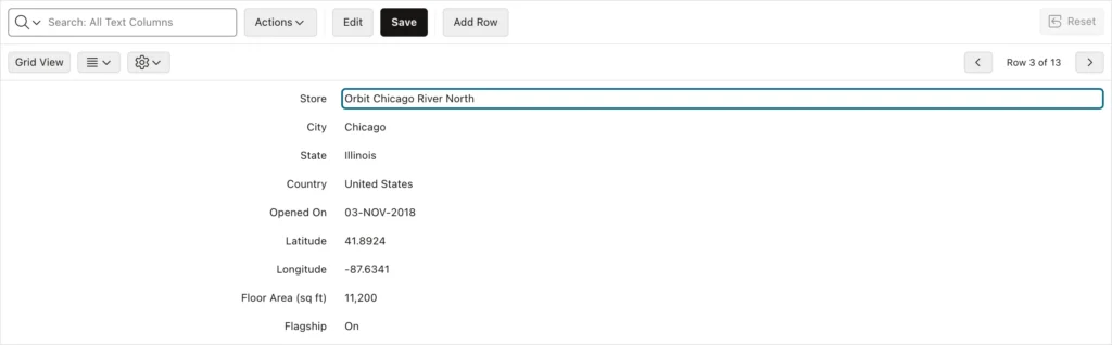
The recordView shows one record of a model as a form of fields, with a toolbar for moving between records. The interactive grid uses it as its single row view, opened with the single-row-view action; the grid view's singleRowView$ property is the widget element.
| Option | Description |
|---|---|
| modelName, recordOffset | The model, and the index of the record to show. |
| fields, fieldGroups | The field definitions, like grid columns, and their group headings. |
| editable, alwaysEdit | Editing, and staying in edit mode permanently. |
| skipDeletedRecords, autoAddRecord | Skip deleted records, and add one when the model is empty. |
| showExcludeHiddenFields, showExcludeNullValues | Offer to hide hidden fields and empty values. |
| labelAlignment, formCssClasses | Label alignment and form classes. |
| toolbar, actionsContext | The toolbar, or none, and an actions context to share. |
| noDataMessage, noDataIcon, showNullAs, idPrefix, hasSize, progressOptions, applyTemplateOptions | As for the other views. |
getRecord, getFields, and fieldElement
Return the record shown, the field definitions, and the element of a field with its label.
Syntax:
recordView.getRecord() → Record
recordView.getFields() → object[]
recordView.fieldElement(pFieldName) → jQuery
Example:
const stores = apex.region("stores");
stores.call("setSelectedRecords", ["7"]);
stores.call("getActions").invoke("single-row-view");      // the Single Row View of the grid
const grid = stores.call("getViews", "grid");
const rv$ = grid.singleRowView$;                            // a recordView widget
console.log("singleRowMode:", grid.singleRowMode);
const model = rv$.recordView("getModel");
console.log("record:", model.getRecordId(rv$.recordView("getRecord")), model.getValue(rv$.recordView("getRecord"), "STORE_NAME"));
console.log("fields:", rv$.recordView("getFields").slice(0, 4).map((f) => f.property));
console.log("CITY field:", rv$.recordView("fieldElement", "CITY").find("label").text());
Output:
singleRowMode: true
record: 7 Orbit Chicago River North
fields: ["APEX$ROW_ACTION", "ID", "STORE_NAME", "CITY"]
CITY field: City
gotoField, setEditMode, inEditMode, getActions, and getToolbar
gotoField shows a record and focuses one of its fields. setEditMode and inEditMode work as in the grid. getActions returns the view's actions, next-record, previous-record, insert-record, delete-record, duplicate-record, refresh-record, revert-record, exclude-null-values, and exclude-hidden, and getToolbar returns its toolbar. The recordView also has getModel, getActiveRecord, getActiveRecordId, setActiveRecordValue, finishEditing, lockActive, unlockActive, refresh, refreshFields, resize, and focus, which work as for the grid. Its events are recordchange, when another record is shown, and modechange.
Syntax:
recordView.gotoField(pRecordId, [pField])
recordView.setEditMode(pEditMode)
recordView.inEditMode() → boolean
recordView.getActions() → actions
recordView.getToolbar() → jQuery
Example:
const stores = apex.region("stores");
stores.call("setSelectedRecords", ["7"]);
stores.call("getActions").invoke("single-row-view");
const rv$ = stores.call("getViews", "grid").singleRowView$;
rv$.on("recordviewrecordchange", () => console.log("recordchange:", rv$.recordView("getModel").getRecordId(rv$.recordView("getRecord"))));
rv$.on("recordviewmodechange", (event, data) => console.log("modechange:", data.editMode));
rv$.recordView("getActions").invoke("next-record");       // the Next button of its toolbar
await new Promise((resolve) => setTimeout(resolve, 300));
rv$.recordView("gotoField", "9", "CITY");
await new Promise((resolve) => setTimeout(resolve, 300));
rv$.recordView("setEditMode", true);
console.log("in edit mode:", rv$.recordView("inEditMode"), "- active:", rv$.recordView("getActiveRecordId"));
console.log("toolbar buttons:", rv$.recordView("getToolbar").find("button").map((i, b) => b.title || b.textContent.trim()).get().join(", "));
rv$.recordView("setEditMode", false);
Output:
recordchange: 12
recordchange: 12
recordchange: 9
modechange: true
in edit mode: true - active: 9
toolbar buttons: Grid View, Change, Settings, Previous, ⌥ Page Up, Next, ⌥ Page Down
modechange: false
Recipes
Color Rows by Their Values
The interactive grid's Highlight feature lets users color rows themselves. To color rows by a rule of your own, such as stores that opened in the last five years, give the grid a highlight rule with the highlights option, and set the rule's ID as the highlight metadata of the matching records. The grid adds the rule's class, hlr_new-store, to their rows.
Put the code in the page's Execute when Page Loads attribute.
Example:
// === Page › Execute when Page Loads ===
// Rows of stores that opened in the last five years get a light amber background.
const grid = apex.region("stores").call("getViews", "grid");
grid.view$.grid("option", "highlights", {
    "new-store": { row: true, background: "#fdf0cf", seq: 1 }       // the rule, as CSS
});
function markNewStores() {
    const since = apex.date.subtract(new Date(), 5, apex.date.UNIT.YEAR);
    grid.model.forEach((record, index, id) => {
        const opened = apex.date.parse(grid.model.getValue(record, "OPENED_ON"), "DD-MON-YYYY");
        const isNew = apex.date.isAfter(opened, since);
        grid.model.getRecordMetadata(id).highlight = isNew ? "new-store" : null;
        grid.model.metadataChanged(id);
    });
}
markNewStores();
grid.model.subscribe({
    onChange: (type) => { if (["refresh", "addData"].includes(type)) markNewStores(); }
});
// === Try it: which rows have the class of the rule ===
apex.region("stores").call("setSelectedRecords", [], false, true);   // (no selection in the picture)
console.log($("#stores tr.hlr_new-store td:nth-child(3)").map((i, cell) => cell.textContent).get());
Output:
[
  "Orbit Austin South Congress",
  "Orbit Minneapolis North Loop",
  "Orbit Asheville Downtown"
]
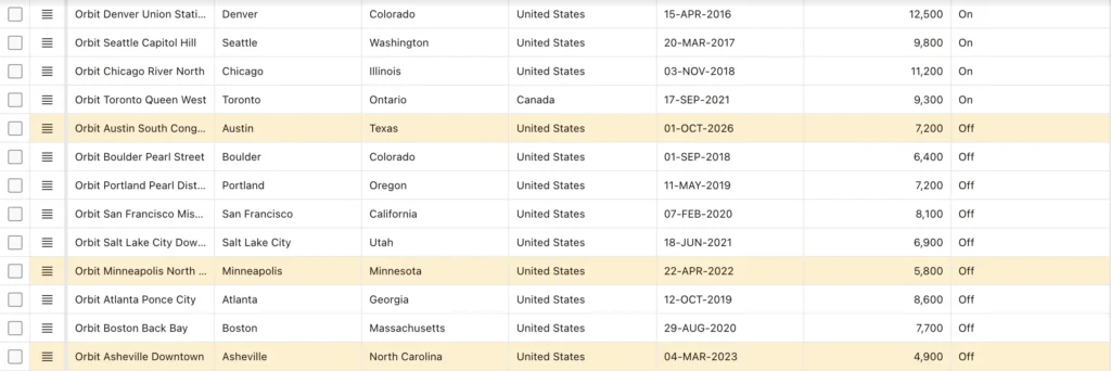
The grid writes the rule's colors as a CSS rule itself, which works even under a strict Content Security Policy. A highlight the user defines from the Actions menu uses the same metadata and replaces yours on the rows it matches. For other ways to color rows, see highlighting values less than zero with jQuery.
Show Fewer Columns on a Phone
Seven columns do not fit on a phone, and the user ends up scrolling sideways through every row. A media query tells the page that the screen is narrow, and hideColumn leaves out the columns that matter least. The query's change event shows them again when the phone turns sideways or a window grows.
Put the code in the page's Execute when Page Loads attribute. The example ran in a window 390 pixels wide, the size of a phone.
Example:
// === Page › Execute when Page Loads ===
// On a narrow screen, the Stores grid shows only its most important columns.
const grid$ = apex.region("stores").call("getViews", "grid").view$;
const optional = ["STATE", "COUNTRY", "OPENED_ON"];
function fitColumns(narrow) {
    for (const column of optional) grid$.grid(narrow ? "hideColumn" : "showColumn", column);
}
const phone = window.matchMedia("(max-width: 640px)");
fitColumns(phone.matches);
phone.addEventListener("change", (event) => fitColumns(event.matches));   // rotating a tablet
// === Try it: open the page on a phone (390 pixels wide) ===
console.log("phone:", phone.matches, "- visible:", grid$.grid("getColumns")
    .filter((c) => !c.hidden && !c.property.startsWith("APEX$")).map((c) => c.property).join(" "));
Output:
phone: true - visible: STORE_NAME CITY FLOOR_AREA_SQFT FLAGSHIP
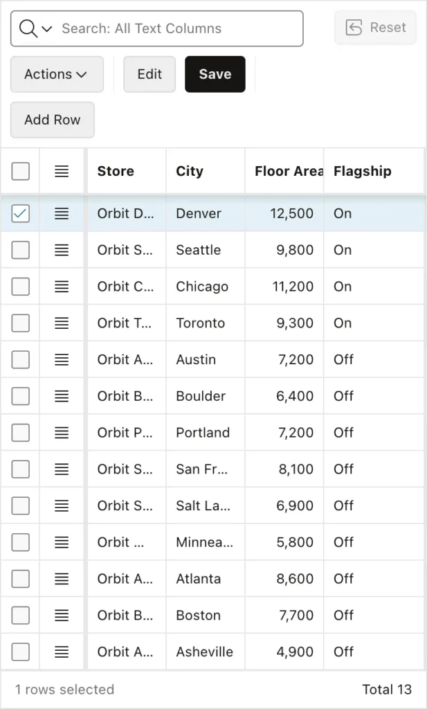
Columns hidden this way are not saved in the user's report, and the user can still show them from the Actions menu. The same media query test is available as apex.theme.mq, covered in the guide to apex.page, apex.navigation, and apex.theme.
Conclusion
The grid, the tableModelView, and the recordView are the widgets that draw a model's records. The grid's options configure columns, row or cell selection, editing, and paging, and its methods hide, move, resize, and freeze columns, select rows and cell ranges, fill and copy down, move the current cell, and switch edit mode. While editing, setActiveRecordValue, finishEditing, and lockActive keep the active row and the model in step, which is the key to setting grid cells reliably from code. The tableModelView renders records through templates, and with #APEX$ROW_IDENTIFICATION# and #APEX$SELECTOR# it gives you selectable lists of your own. The recordView is the form behind the single row view, with its own actions and events.
