
A table is the right shape for data people compare cell by cell. For a product catalog, an activity feed, or a row of key numbers at the top of a dashboard, it is the wrong shape entirely. People scan cards and lists far faster than they scan rows, and cards survive a phone screen where a twelve-column table does not.
Oracle APEX has a whole family of regions for this, and they all work the same way: write a query, then say which column belongs in which part of the layout. This guide builds three of them, a catalog of image cards, a recent activity list, and a set of metric cards, and covers the little template language that makes them flexible.
What Template Components Are
Most regions in this article are template components. Each one takes your query, runs every row through an HTML template that belongs to the theme, and renders the result. Because the template comes from the theme, the output matches the rest of your application automatically, and your only job is mapping columns to slots.
| Component | Shows each row as |
|---|---|
| Actions | A set of buttons and menus |
| Avatar | An image, icon, or initials in a circle or square |
| Badge | A small labeled value, such as a status |
| Comments | A comment with its author and date |
| Content Row | A list row with avatar, title, description, badge, and actions |
| Flexbox Container | A flexible container that arranges its sub-regions |
| Media List | A list item with an image or icon and text |
| Metric Card | A key figure with a label and details, new in 26.1 |
| Timeline | An event on a vertical timeline |
Cards is a region type in its own right with more options, but the idea is identical. Every template component also has a Display setting: Multiple shows one entry per row like a report, while Single shows only the first row, which is how you drop a lone badge or avatar into a page header.
APEX 26.1 adds the Metric Card and Blank Page components, lets avatars, timelines, comments, and media lists display groups, and highlights template directives in the code editor as you type them.
Building a Product Catalog with Cards
Start with the query. This one joins a product view to the product table, because the view has the calculated stock figures while the table holds the image.
select v.product_id,
       v.sku,
       v.product_name,
       v.category_name,
       v.unit_price,
       to_char(v.unit_price, 'FML999G990D00') as price,
       v.stock_on_hand,
       v.avg_rating,
       v.review_count,
       v.needs_reorder,
       p.description,
       p.product_image,
       p.image_mime_type,
       p.image_updated_on
  from orb_products_v v
  join orb_products p
    on p.product_id = v.product_id
 where v.is_active
Notice the price is formatted in SQL with to_char. Substitutions in a template print values exactly as they arrive, so formatting numbers and dates in the query, or with a column format mask, keeps the template itself simple.
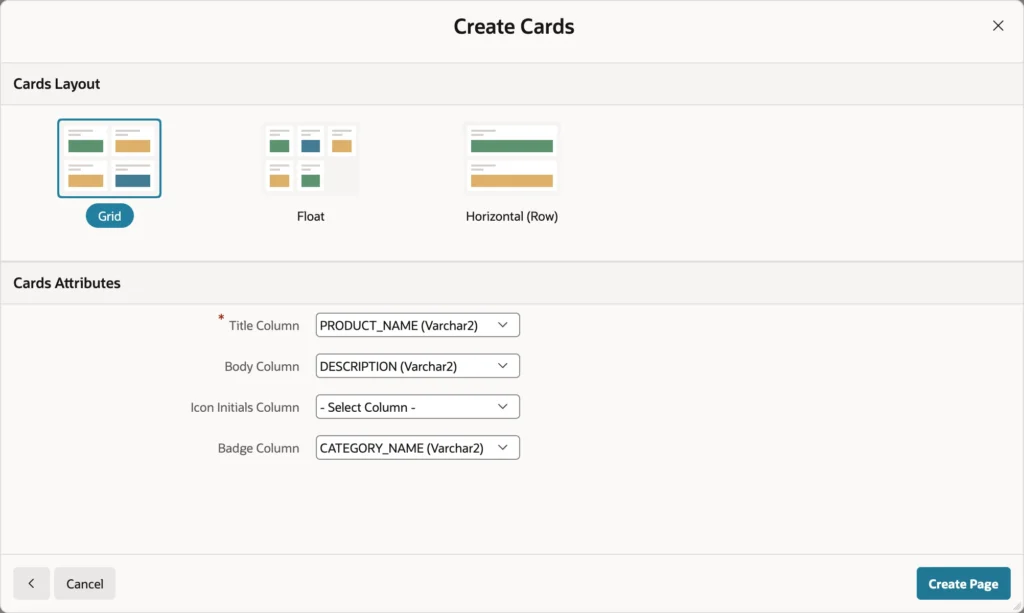
- Click Create Page, then Cards.
- Give it a number, a name, and an icon.
- Set Data Source to Local Database and Source Type to SQL Query, then paste the query.
- Click Next, choose the Grid layout, and map the title, body, and badge columns.
- Click Create Page.
The three layouts are worth knowing before you choose. Grid lines cards up in columns of equal width, Float lets each card take the width it needs and wrap, and Horizontal gives every card its own row with the image at the side.
The wizard also gives you something you did not ask for and will be glad of: a sort order select list above the cards, wired to the region's Order By property, so users can reorder the catalog themselves.
The Parts of a Card
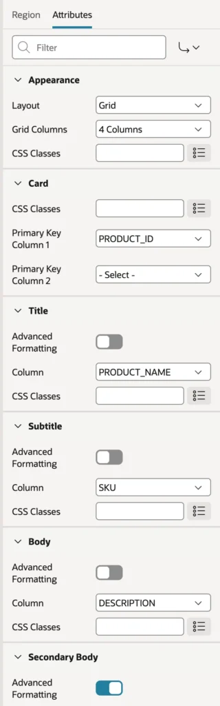
- Appearance sets the layout and, for a grid, how many columns.
- Card sets the primary key column, which card actions and image loading both need.
- Title, Subtitle, Body, and Secondary Body hold the text, each taken from a column or, with Advanced Formatting on, written as an HTML expression.
- Icon and Badge place an icon at the top of the card and a badge at its top right.
- Media places an image, from a URL or a BLOB column.
- Pagination chooses scrolling or paging, and whether to show a total count.
Images Straight from a BLOB Column
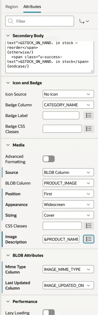
Set Source to BLOB Column and pick the column holding the image. Position it first so it sits at the top of the card, choose an aspect such as Widescreen, and set Sizing to Cover so the picture fills its frame instead of leaving gaps. Put a column substitution in Image Description, because that is what a screen reader announces. Then, under BLOB Attributes, name the mime type column and the last updated column.
Those last two settings do more than they appear to. APEX never embeds images in the page: it generates a URL per image and lets the browser fetch them separately, so the cards render immediately and pictures fill in behind them. The last updated column lets the browser cache an image until it actually changes, and the primary key is how APEX knows which row's image to serve. That is why a BLOB image needs a key column. If you are working with images elsewhere, the same mechanism underlies displaying BLOB contents in a region.
Template Directives
Plain substitutions cover most of a card, but sometimes the output depends on the data: show the stock in red with a warning when a product needs reordering, in green when it does not. That is what template directives are for.
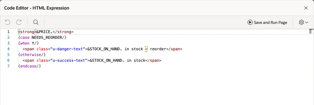
<strong>&PRICE.</strong>
{case NEEDS_REORDER/}
{when Y/}
  <span class="u-danger-text">&STOCK_ON_HAND. in stock – reorder</span>
{otherwise/}
  <span class="u-success-text">&STOCK_ON_HAND. in stock</span>
{endcase/}
An ampersand, a column name, and a period is a substitution, replaced with that column's value for the current row and escaped for HTML. The pieces in braces are the logic.
| Directive | Does |
|---|---|
| if, elsif, else, endif | Outputs a part only when a column has a value, choosing between alternatives |
| case, when, otherwise, endcase | Outputs the part matching a column's value |
| loop and endloop | Repeats a part for every value in a delimited list |
| with and apply | Renders another template component inline, such as a badge or an avatar |
Directives work anywhere APEX accepts an HTML template: cards, template components, the HTML expressions of report columns, and theme templates. Learn them once and they pay off across the whole product.
Making Cards Clickable
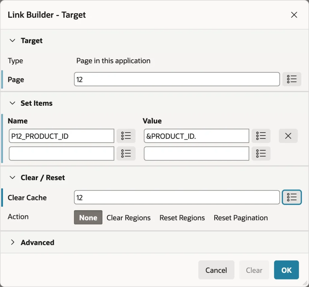
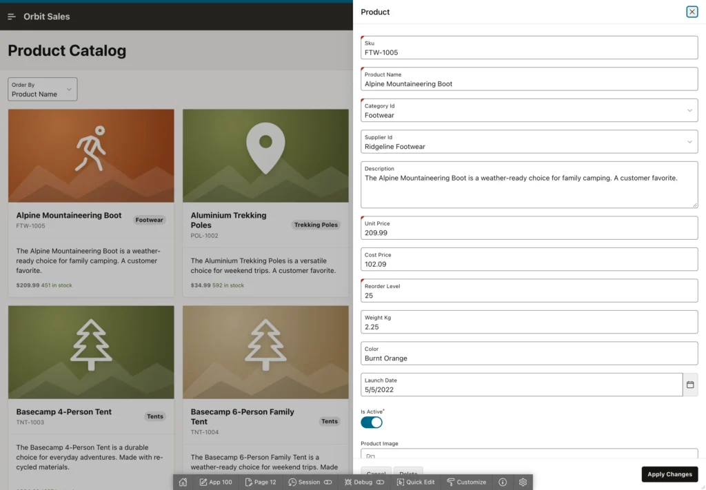
Right-click the Actions node under the region and create an action. Set its type to Full Card to make the whole card clickable, or restrict the click to the title, subtitle, media, or a button you add. Then point the link at your form page, pass the key with a substitution, and clear that page's cache so the form does not open holding the previous product.
The Catalog at Work
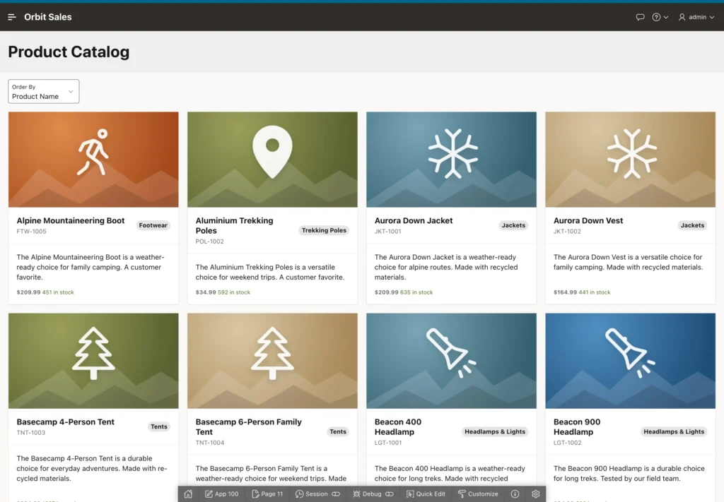
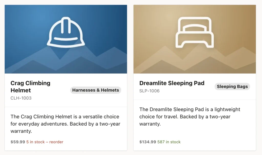
The directive is easiest to appreciate side by side. One product is below its reorder level and says so in red, the other has plenty and shows green, and both came out of a single template.
An Activity List with Content Row
A Content Row renders each row as a line in a list: avatar on the left, an overline, title, and description in the middle, a badge and a miscellaneous value on the right, and optional actions. It suits activity feeds, inboxes, and short summaries on a dashboard.
select order_id,
       order_number,
       customer_name,
       upper(substr(customer_name, 1, 1)) ||
       upper(substr(customer_name, instr(customer_name, ' ') + 1, 1)) as initials,
       sales_rep,
       order_date,
       to_char(order_total, 'FML999G999G990D00') as total,
       status_label,
       case status
         when 'PENDING_APPROVAL' then 'warning'
         when 'CANCELLED'        then 'danger'
         when 'DELIVERED'        then 'success'
         else                         'info'
       end as status_state
  from orb_orders_v
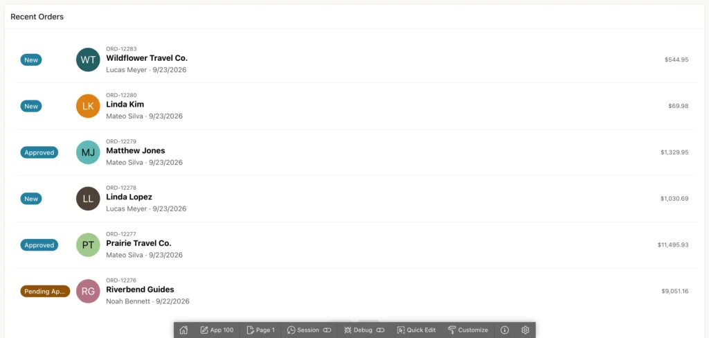
The query does two clever things. It builds initials for the avatar out of the customer name, and it translates each status into a state name. Those state names are not decoration: the badge uses them to pick its color, so pending approvals come out amber and cancellations red without a line of CSS.
One rule catches everybody once. Do not put an ORDER BY in the query. Page Designer refuses to save the page and tells you to use the region's Order By property instead, because APEX has to combine your sort with pagination, and for cards with the user's own choice in the sort list.
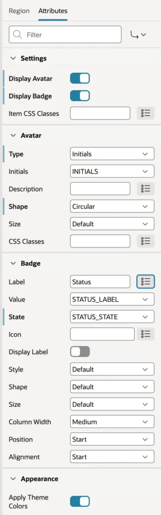
Create the region below an existing one, set its type to Content Row, choose the Standard template if you want its title displayed, and map the attributes. Switch on the avatar, set its type to Initials and point it at the initials column, then switch on the badge with its label, value, and state columns. Set the entities per page to something small, because a dashboard list should not run on forever.
Key Figures with Metric Cards
The Metric Card, new in APEX 26.1, shows one number prominently with a label, an optional icon, and a line of detail. A row of them across the top of a dashboard is a well-worn pattern for good reason.
The trick is a query that returns one row per figure, which a few unions handle neatly.
select 'Sales this month' as label,
       to_char(sum(order_total), 'FML999G999G990') as value,
       'fa-line-chart' as icon,
       count(*) || ' orders' as detail
  from orb_orders
 where order_date >= trunc(sysdate, 'MM')
   and status <> 'CANCELLED'
union all
select 'Average order',
       to_char(avg(order_total), 'FML999G990D00'),
       'fa-shopping-cart',
       'last 30 days'
  from orb_orders
 where order_date >= trunc(sysdate) - 30
   and status <> 'CANCELLED'
union all
select 'Awaiting approval',
       to_char(count(*)),
       'fa-clock-o',
       'orders pending'
  from orb_orders
 where status = 'PENDING_APPROVAL'
union all
select 'Products to reorder',
       to_char(count(*)),
       'fa-exclamation-triangle',
       'below reorder level'
  from orb_products_v
 where needs_reorder = 'Y'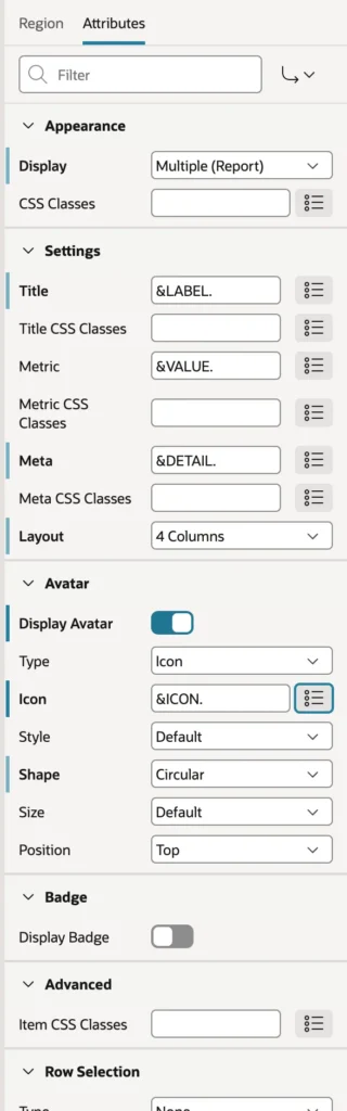
Create a region of type Metric Card, and set its template to Blank with Attributes so the cards stand alone instead of sitting inside a boxed region. Map the title, metric, and meta attributes to your columns, choose a column layout, then switch on the avatar and feed it the icon column. Because each figure names its own icon in the query, adding a fifth metric later means editing SQL, not Page Designer.
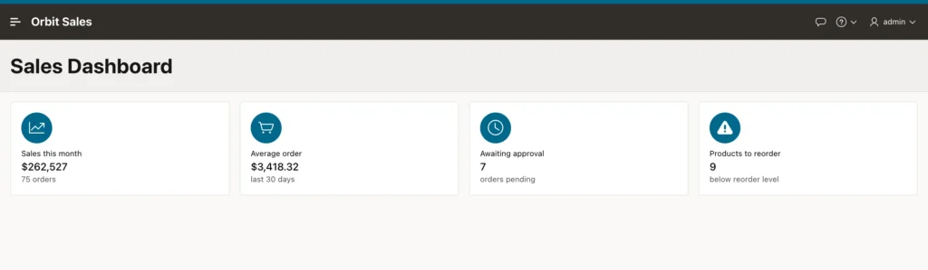
Metric cards have an Actions node too, so you can make each figure a link. Pointing Awaiting approval at a filtered orders page turns a dashboard from something people read into something they use.
The Other Components
The rest follow the same recipe: pick the type, write a query, map columns to attributes.
- Media List: a compact list with an icon or image, a title, and a description. Good for link menus and small catalogs.
- Timeline: events in date order, each with a user, a date, and a description. Good for the history of an order or a customer.
- Comments: a discussion thread with author, date, and text.
- Badge and Avatar: usually with Display set to Single, to show one status or picture in a page header.
- Actions: a row of buttons and menus defined declaratively.
Each can be tried in seconds by setting the region's location to Sample Data before you write any SQL. If you inherit an old application containing List View regions, they are legacy, and a Content Row or Media List replaces them on new pages.
Custom Template Components
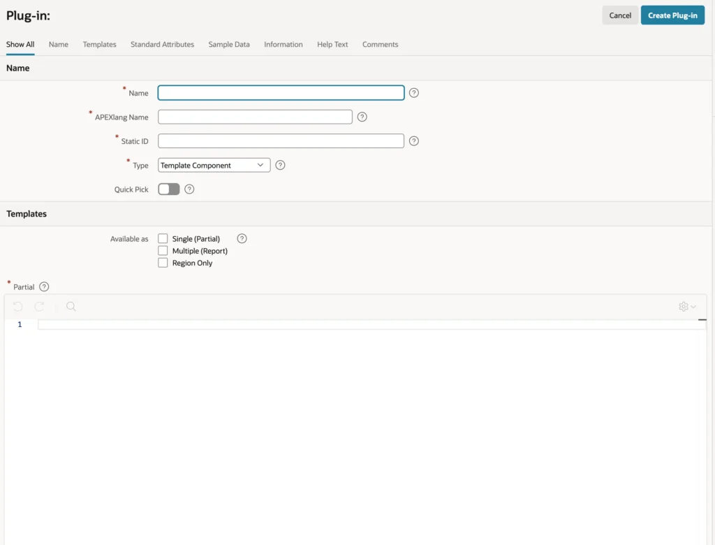
Every component described here is a plug-in of type Template Component, which means nothing stops you from building one. A custom component is an HTML template with directives plus a set of attributes that developers fill in, exactly like the Metric Card's title and metric. Once created it appears in the region type list beside the built-in ones, and as an interactive report column type.
You create one under Shared Components, Plug-ins, choosing From Scratch and the Template Component type. It asks whether the component is available as Single, Multiple, or both, for the HTML of one entry, for the escape mode, and for whether it supports row selection.
The judgment call is when to bother. Build a custom component when the same presentation would otherwise be copied as an HTML expression from region to region across many pages. Anything you will write once is better left as an HTML expression with directives.
Conclusion
Cards, content rows, and metric cards present data the way people actually read it, and all of them run on the same idea: your query supplies the values, the theme supplies the markup, and you map one to the other. A cards region fills its title, subtitle, body, badge, and media from columns, serves images straight from BLOB columns through generated URLs, and turns clicks into navigation with card actions. Template components such as Content Row and the new Metric Card work identically, with Multiple display for lists and Single for a lone badge or avatar, and they sort through the region's Order By property rather than an ORDER BY in the query. Template directives add the conditional logic that raw substitutions cannot express, so one template can show a red warning or a green reassurance depending on the row, and they work everywhere APEX accepts HTML. Put the formatting in your SQL, let the theme handle the styling, and reach for a custom template component only when the same layout starts spreading across page after page.
