
An action in Oracle APEX is a named command, such as Refresh Orders, Save, or Toggle Edit, with a label, an icon, a state, and optionally a keyboard shortcut. Buttons, checkboxes, select lists, and menu items bind to an action by name and take their label and state from it, so when the action changes, every element bound to it follows. APEX builds its own toolbars on actions: the interactive grid's toolbar and Actions menu are actions, and so are the special #action$ URLs that open dialogs.
This guide covers the whole actions facility with tested examples and real output: defining plain, toggle, and radio group actions, binding elements to them, changing their state, keyboard shortcuts, and action contexts, including how to drive an interactive grid through its own actions. Two recipes at the end add Ctrl+S to save a form and a dialog that lists the page's shortcuts.
Quick Reference
| Task | Method or function |
|---|---|
| Define actions | add, addFromMarkup |
| Run and find actions | invoke, lookup, list |
| Read and change toggle or radio values | get, set, toggle, updateChoices |
| Change state | disable, enable, hide, show, update |
| React to changes | observe, unobserve |
| Remove actions | remove, clear |
| Keyboard shortcuts | addShortcut, removeShortcut, listShortcuts, shortcutDisplay, ariaKeyshortcut, disableShortcuts, enableShortcuts |
| Key names and shortcut mode | apex.actions.setKeyCaps, getKeyCaps, shortcutSupport |
| Scoped contexts | apex.actions.createContext, removeContext, findContext, findContextById, getContextTypes, getContextsForType |
How to Run These Examples
The examples ran in Oracle APEX 26.1 on a test application, mostly on a home page with a Recent Orders region whose header gets the example buttons. The output under each example is exactly what the browser console printed, on a Mac, which is why shortcuts display with Mac key symbols such as ⌥ and ⌘.
To try one, open a page of your own, press F12, paste the code into the Console tab, and replace the region selectors with your own. A few examples use await at the top level, which the console allows; inside a dynamic action, wrap such code in an async function.
Actions and Contexts
Actions live in a context. The global context, apex.actions, covers the whole page. Widgets such as the interactive grid create a context of their own for their element, so two grids on one page can each have an action called save. apex.actions is both the namespace for the context functions and the global context itself, so the methods below are called either on apex.actions or on another context.
Defining and Invoking Actions
actions.add
Adds one action or an array of actions to the context. It returns false, with a debug warning, when an action is invalid, for example a duplicate name or shortcut. Elements in the context whose data-action attribute names the action are bound to it: a button takes its label, title, and icon from the action and invokes it when clicked.
actions.add(pActions) → boolean
There are three kinds of action:
- A plain action runs a function, action(event, focusElement, args), or navigates to href. It binds to buttons, links, and menu items. The function returns true when it has set the focus itself.
- A toggle has get and set functions for a Boolean value. It binds to checkboxes, toggle buttons, and check menu items.
- A radio group has choices plus get and set functions for the chosen value. It binds to radio groups, select lists, and radio menu items.
| Property | Description |
|---|---|
| name | The unique name, such as refresh-orders. |
| label, title, contextLabel | The label, the tooltip, and a longer label for lists of actions and shortcuts. |
| onLabel, offLabel, onIcon, offIcon | A toggle's label and icon for each state. |
| icon, iconType | Icon classes. The type defaults to a-Icon. |
| shortcut | The keyboard shortcut, such as Alt+Shift+R. |
| disabled, hide | The state of the bound elements. |
| action, href, target | What the action does: a function, or a URL to open. |
| get, set | For toggles and radio groups: read and change the value. |
| choices | For radio groups: objects with label, value, icon, shortcut, disabled, and group. |
| idArg, instanceSelector | For an action bound to a button in every row of a report: the argument that identifies the row, and the row's selector. |
| convertBindingArguments | Convert the data-args values of bound elements to numbers and Booleans. |
| purpose | For links: action or dialog, used for aria-roledescription. |
// A button bound to an action: data-action names it.
apex.jQuery("#recent_orders .t-Region-headerItems--buttons")
    .append(`<button type="button" class="t-Button" data-action="orbit-refresh-orders"></button>`);
apex.actions.add({
    name: "orbit-refresh-orders",
    label: "Refresh Orders",
    title: "Get the latest orders",
    shortcut: "Alt+Shift+R",
    action: (event, focusElement, args) => {
        console.log("action: refreshing", args.region);
        apex.region(args.region).refresh();
    }
});
const button = apex.jQuery("[data-action='orbit-refresh-orders']");
console.log("button:", button.text(), "- title:", button.attr("title"));
apex.actions.invoke("orbit-refresh-orders", null, null, { region: "recent_orders" });
console.log(apex.actions.lookup("orbit-refresh-orders").shortcut);
Output:
button: Refresh Orders - title: Get the latest orders, ⌥ ⇧ R
action: refreshing recent_orders
Alt+Shift+R
The button was empty in the markup and took its label from the action, and its tooltip shows the shortcut in the keyboard's own symbols. Order matters: add the elements first, then the action, because APEX binds the data-action elements that exist at the moment the action is added.
actions.invoke
Runs an action as if the user had clicked it: it calls the action's function with the event, the element to focus afterwards, and the arguments, or navigates to its href. It does nothing for a disabled or hidden action. The add example above invokes an action with an argument.
actions.invoke(pActionName, [pEvent], [pFocusElement], [pArgs]) → boolean | undefined
actions.lookup
Returns the action object with the given name, or undefined. If you change its properties, call update afterwards, or updateChoices for its choices, so bound elements catch up.
actions.lookup(pActionName) → action
actions.list
Returns the name and label of every action in the context, with one entry per choice for radio groups.
actions.list() → object[]
console.log("typeName:", apex.actions.typeName, "- context:", apex.actions.context.tagName);
console.log(apex.actions.list().slice(0, 6));
Output:
typeName: global - context: BODY
[
  {
    "name": "a-redirect"
  },
  {
    "name": "a-submit"
  },
  {
    "name": "a-set-value"
  },
  {
    "name": "a-back"
  },
  {
    "name": "a-dialog-open"
  },
  {
    "name": "a-dialog-close"
  }
]
The first actions in the global context are APEX's own. They have no labels because they are not meant for buttons; they are what the #action$ URLs invoke, such as a-dialog-open for links to dialog pages, covered in the guide to submitting pages and opening dialogs with apex.page and apex.navigation.
actions.addFromMarkup
Adds actions from list markup: a ul of li elements, each holding an a or span. data-id becomes the name and the element's text the label, while title, href, target, data-shortcut, data-icon, data-disabled, and data-hide set the other properties. This can be easier when the list is rendered on the server. Actions that run a function cannot come from markup; add the function afterwards.
actions.addFromMarkup(pList$)
// Actions from list markup: li[data-id] is the name, the link text the label.
apex.actions.addFromMarkup(apex.jQuery(`<div><ul>
<li data-id="orbit-docs" data-shortcut="Alt+D"><a href="https://docs.oracle.com/en/database/oracle/apex/26.1/" target="_blank">APEX Documentation</a></li>
<li data-id="orbit-orders" data-icon="fa fa-list"><a href="f?p=&APP_ID.:orders">Orders</a></li>
<li data-id="orbit-hidden" data-hide="true"><span title="Not shown">Hidden Action</span></li>
</ul></div>`));
for (const name of ["orbit-docs", "orbit-orders", "orbit-hidden"]) {
const { label, shortcut, target, icon, hide } = apex.actions.lookup(name);
console.log(name, { label, shortcut, target, icon, hide });
}Output:
orbit-docs {"label":"APEX Documentation", "shortcut":"Alt+D", "target":"_blank"}
orbit-orders {"label":"Orders", "shortcut":null, "icon":"fa-list"}
orbit-hidden {"label":"Hidden Action", "shortcut":null, "hide":true}
Toggle and Radio Group Actions
actions.get, set, and toggle
get returns the value of a toggle or radio group action, set changes it, and toggle flips a toggle. They call the action's own get and set functions and update the bound elements; a toggle button gets the class is-active when on.
actions.get(pActionName, [pArgs]) → *
actions.set(pActionName, pValue, [pArgs])
actions.toggle(pActionName, [pArgs])
let compact = false;
// the element comes first: APEX binds data-action elements when the action is added
apex.jQuery("#recent_orders .t-Region-headerItems--buttons")
    .append(`<button type="button" class="t-Button" id="compact_btn" data-action="orbit-compact"></button>`);
apex.actions.add({
    name: "orbit-compact",
    label: "Compact View",
    get: () => compact,
    set: (value) => { compact = value; apex.jQuery("#recent_orders").toggleClass("orbit-compact", value); }
});
const state = () => `value ${apex.actions.get("orbit-compact")}, button active ${apex.jQuery("#compact_btn").hasClass("is-active")}`;
console.log("start:      ", state());
apex.actions.toggle("orbit-compact");
console.log("toggle():   ", state());
apex.actions.set("orbit-compact", false);
console.log("set(false): ", state());
apex.jQuery("#compact_btn").trigger("click");              // the user clicks the button
console.log("user click: ", state());
Output:
start:       value false, button active false
toggle():    value true, button active true
set(false):  value false, button active false
user click:  value true, button active true
The button stayed in step with the value whether code or the user changed it. That is not true of checkboxes in 26.1: a checkbox bound to a toggle action is not updated when code calls set or toggle, and drifts out of step with the action. Bind toggles to buttons or menus instead.
actions.updateChoices
Tells the bound elements that a radio group action's choices have changed.
actions.updateChoices(pActionName) → boolean
let period = "WEEK";
apex.jQuery("#recent_orders .t-Region-headerItems--buttons").append(`<select data-action="orbit-period"></select>`);
apex.actions.add({
    name: "orbit-period",
    label: "Period",
    choices: [{ label: "Today", value: "DAY" }, { label: "This Week", value: "WEEK" }, { label: "This Month", value: "MONTH" }],
    get: () => period,
    set: (value) => { period = value; console.log("set:", value); }
});
const select = apex.jQuery("select[data-action='orbit-period']");
console.log("select options:", select.find("option").map((i, o) => o.textContent).get().join(", "), "- selected:", select.val());
apex.actions.set("orbit-period", "MONTH");
console.log("get:", apex.actions.get("orbit-period"), "- select:", select.val());
apex.actions.lookup("orbit-period").choices.push({ label: "This Year", value: "YEAR" });
apex.actions.updateChoices("orbit-period");
console.log("after updateChoices:", select.find("option").length, "options");
Output:
select options: Today, This Week, This Month - selected: WEEK
set: MONTH
get: MONTH - select: MONTH
after updateChoices: 4 options
An empty select list bound to the action was filled with the choices and kept in sync with the value, and pushing a new choice followed by updateChoices added the fourth option.
Changing an Action's State
actions.disable, enable, hide, and show
Change an action's disabled or hide property and update the bound elements. They are shortcuts for lookup, change, and update. A disabled or hidden action cannot be invoked. For an action bound in every row of a report, pArgs identifies the row.
actions.disable(pActionName, [pArgs])
actions.enable(pActionName, [pArgs])
actions.hide(pActionName, [pArgs])
actions.show(pActionName, [pArgs])
actions.update
Updates the bound elements and notifies observers after you have changed an action's properties directly.
actions.update(pActionName, [pArgs]) → boolean
apex.actions.add({ name: "orbit-export", label: "Export", action: () => console.log("exporting") });
apex.jQuery("#recent_orders .t-Region-headerItems--buttons")
    .append(`<button type="button" class="t-Button" data-action="orbit-export"></button>`);
const button = apex.jQuery("[data-action='orbit-export']");
apex.actions.disable("orbit-export");
console.log("disabled:", button.prop("disabled"));
console.log("invoke while disabled:", apex.actions.invoke("orbit-export"));
apex.actions.enable("orbit-export");
apex.actions.hide("orbit-export");
console.log("visible:", button.is(":visible"));
apex.actions.show("orbit-export");
console.log("visible:", button.is(":visible"));
const action = apex.actions.lookup("orbit-export");
action.label = "Export CSV";
apex.actions.update("orbit-export");
console.log("label after update:", button.text());
Output:
disabled: true
invoke while disabled: undefined
visible: false
visible: true
label after update: Export CSV
This is the real advantage of actions over plain buttons: disable the action once, and every button, menu item, and shortcut bound to it is disabled together. With several buttons for the same command, there is no risk of forgetting one.
actions.observe and unobserve
Register and remove a function that runs whenever an action changes. It receives the action, the operation (add, remove, update, or updateChoices), and the arguments. Buttons, checkboxes, select lists, and menus are already kept up to date for you; observe actions to update other elements, such as a custom status bar.
actions.observe(pCallback)
actions.unobserve(pCallback)
const observer = (action, operation) => console.log("observed:", operation, action.name);
apex.actions.observe(observer);
apex.actions.add({ name: "orbit-print", label: "Print", action: () => window.print() });
apex.actions.disable("orbit-print");
apex.actions.remove("orbit-print");
apex.actions.unobserve(observer);
apex.actions.add({ name: "orbit-print", label: "Print", action: () => window.print() });
console.log("after unobserve: nothing observed");
Output:
observed: add orbit-print
observed: update orbit-print
observed: remove orbit-print
after unobserve: nothing observed
actions.remove and clear
remove removes actions by name or object, and clear removes every action in the context. Never clear the global context, because it holds actions APEX itself needs. The observe example above removes an action, and the createContext example below clears a context.
actions.remove(pActions)
actions.clear()
Keyboard Shortcuts
A shortcut is written as [Ctrl+][Alt+][Meta+][Shift+]key, with the modifiers in that order. The key is a letter, a digit, or a US-keyboard name such as F2, Home, Enter, or Comma. CtrlOrMeta means Command on macOS and Ctrl elsewhere. A comma-separated sequence such as Ctrl+K,S is typed one combination after the other, and a single-key sequence such as G allows shortcuts without a modifier.
A shortcut works while the focus is inside the action's context, and shortcuts that would type a character are ignored while the focus is in a text field, so users can still type.
actions.addShortcut, removeShortcut, and listShortcuts
addShortcut adds another shortcut for an action, alongside its shortcut property; for a radio group, it can select a specific choice. removeShortcut removes such an extra shortcut, and listShortcuts returns every shortcut in the context.
actions.addShortcut(pShortcutName, pActionName, [pChoiceValue]) → boolean
actions.removeShortcut(pShortcutName) → boolean
actions.listShortcuts([pWithMarkup]) → object[]
actions.shortcutDisplay and ariaKeyshortcut
Return a shortcut formatted for display to the user, with the key caps of their keyboard, and in the format the aria-keyshortcuts attribute expects.
actions.shortcutDisplay(pShortcutName, [pWithMarkup]) → string
actions.ariaKeyshortcut(pShortcutName) → string
actions.disableShortcuts and enableShortcuts
Switch all shortcuts off and on again, for example while a custom popup is open. APEX's own dialogs and menus do this for you. The calls nest, so every disableShortcuts needs its own enableShortcuts.
actions.disableShortcuts()
actions.enableShortcuts()
apex.actions.add({ name: "orbit-new-order", label: "New Order", shortcut: "Alt+N",
                   action: () => { console.log("action: new order"); return true; } });
apex.actions.addShortcut("Ctrl+Alt+O", "orbit-new-order");
console.log(apex.actions.listShortcuts().filter((s) => s.actionName === "orbit-new-order"));
console.log("display:", apex.actions.shortcutDisplay("Ctrl+Alt+O"), "- aria:", apex.actions.ariaKeyshortcut("Ctrl+Alt+O"));
const press = (key, mods) => document.body.dispatchEvent(new KeyboardEvent("keydown", { key, code: "Key" + key.toUpperCase(), keyCode: key.toUpperCase().charCodeAt(0), bubbles: true, ...mods }));
press("n", { altKey: true });                              // the user presses Alt+N
apex.actions.disableShortcuts();
press("n", { altKey: true });                              // ignored
apex.actions.enableShortcuts();
console.log("removeShortcut:", apex.actions.removeShortcut("Ctrl+Alt+O"));
Output:
[
  {
    "shortcut": "Alt+N",
    "shortcutDisplay": "⌥ N",
    "actionName": "orbit-new-order",
    "actionLabel": "New Order"
  },
  {
    "shortcut": "Ctrl+Alt+O",
    "shortcutDisplay": "⌃ ⌥ O",
    "actionName": "orbit-new-order",
    "actionLabel": "New Order"
  }
]
display: ⌃ ⌥ O - aria: Control+Alt+O
action: new order
removeShortcut: true
The action ran once, for the first key press. The second press did nothing because shortcuts were disabled.
apex.actions.setKeyCaps, getKeyCaps, and shortcutSupport
setKeyCaps sets the names shown for keys, for keyboards whose keys are labeled differently, and null clears them; getKeyCaps returns them. shortcutSupport returns or sets how shortcuts are recognized: "sequence", the default, allows two-key sequences, "single" allows only single combinations, and "off" disables shortcuts.
apex.actions.setKeyCaps(pKeyCaps)
apex.actions.getKeyCaps() → object
apex.actions.shortcutSupport([pShortcutType]) → string
console.log("keycaps:", apex.actions.getKeyCaps());
console.log(apex.actions.shortcutDisplay("Ctrl+Shift+S"));
apex.actions.setKeyCaps({ Ctrl: "Strg", Shift: "Umschalt" });                 // a German keyboard
console.log(apex.actions.shortcutDisplay("Ctrl+Shift+S"));
apex.actions.setKeyCaps(null);
console.log("shortcutSupport:", apex.actions.shortcutSupport());
Output:
keycaps: {"Alt":"⌥", "Meta":"⌘", "Ctrl":"⌃", "Shift":"⇧", "Backspace":"Delete"}
⌃ ⇧ S
Strg Umschalt S
shortcutSupport: sequence
Scoped Contexts
apex.actions.createContext and removeContext
Create a context of actions scoped to an element, and remove it again. The actions and shortcuts of a context apply to elements inside it, so two widgets on one page can use the same action names. A widget typically creates its context when it initializes and removes it when it is destroyed. A context's context and typeName properties hold its element and type; the global context has the type global.
apex.actions.createContext(pTypeName, pContext) → actions
apex.actions.removeContext(pTypeName, pContext)
apex.actions.findContext, findContextById, getContextTypes, and getContextsForType
Find contexts by type and element, or by the ID of the element or of the region whose widget created it ("global" for the global context), and list all context types or all contexts of one type.
apex.actions.findContext([pTypeName], pContext) → actions
apex.actions.findContextById(pContextId) → actions
apex.actions.getContextTypes() → string[]
apex.actions.getContextsForType(pTypeName) → actions[]
const panel = apex.jQuery(`<div id="orbit_panel" tabindex="-1"><button type="button" data-action="save-note">Save</button></div>`)
    .appendTo("#recent_orders .t-Region-body")[0];
const panelActions = apex.actions.createContext("orbitPanel", panel);
panelActions.add({ name: "save-note", label: "Save Note", action: () => console.log("saved in the panel context") });
console.log("typeName:", panelActions.typeName, "- context:", panelActions.context.id);
console.log("types:", apex.actions.getContextTypes());
console.log("findContext:", apex.actions.findContext("orbitPanel", panel) === panelActions,
            "- findContextById:", apex.actions.findContextById("orbit_panel") === panelActions);
console.log("contexts of type:", apex.actions.getContextsForType("orbitPanel").length);
panelActions.invoke("save-note");
console.log("in the global context:", apex.actions.lookup("save-note") ?? "(not there)");
panelActions.clear();
apex.actions.removeContext("orbitPanel", panel);
console.log("after removeContext:", apex.actions.getContextTypes());
Output:
typeName: orbitPanel - context: orbit_panel
types: ["global", "orbitPanel"]
findContext: true - findContextById: true
contexts of type: 1
saved in the panel context
in the global context: (not there)
after removeContext: ["global"]
The action added to the panel's context was invisible to the global context, which is exactly the isolation contexts are for.
An interactive grid has its own context, holding every action of its toolbar and menus. findContextById with the grid region's ID returns it:
const gridActions = apex.actions.findContextById("stores");      // the interactive grid's context
console.log("typeName:", gridActions.typeName, "- actions:", gridActions.list().length);
console.log(gridActions.list().filter((a) => /save|refresh|selection-add|edit/.test(a.name)).slice(0, 6));
console.log("edit mode:", gridActions.get("edit"));
gridActions.set("edit", true);
console.log("edit mode:", gridActions.get("edit"));
Output:
typeName: InteractiveGrid - actions: 66
[
  {
    "name": "save-report",
    "label": "Save"
  },
  {
    "name": "show-save-report-as-dialog",
    "label": "Save As"
  },
  {
    "name": "show-edit-report-dialog",
    "label": "Edit"
  },
  {
    "name": "selection-refresh",
    "label": "Refresh Rows"
  },
  {
    "name": "refresh",
    "label": "Refresh"
  },
  {
    "name": "edit",
    "label": "Toggle Edit"
  }
]
edit mode: false
edit mode: true
Invoking and setting the grid's actions is how you drive it from your own buttons, for example switching on edit mode or saving. The same technique is behind creating custom add, edit, save, and delete buttons for an interactive grid, and the grid itself is covered in the complete interactive grid guide.
Recipes
Save a Form with Ctrl+S
Users of desktop programs expect Ctrl+S, or Command+S on a Mac, to save. An action with the shortcut CtrlOrMeta+S submits the page with the request SAVE, exactly like the Apply Changes button, and stops the browser's own Save Page As dialog from opening.
Put the code in the page's Execute when Page Loads attribute. The Try it parts only open an order and simulate the key press; the handler there stops the submit so the example stays on the page.
// === Try it: open an order from the Orders page ===
$("#orders a[href*='order']").first()[0].click();
// --- on the Order page ---
// === Page › Execute when Page Loads ===
apex.actions.add({
    name: "save-order",
    label: "Save Order",
    shortcut: "CtrlOrMeta+S",                         // Command+S on macOS, Ctrl+S elsewhere
    action: () => apex.page.submit("SAVE")            // what the Apply Changes button does
});
// show the shortcut on the button, the way the user's keyboard writes it
$("#save_order").attr("title", "Apply Changes (" + apex.actions.shortcutDisplay("CtrlOrMeta+S") + ")");
// === Try it: type in Notes and press the shortcut (the submit is stopped here) ===
apex.gPageContext$.on("apexbeforepagesubmit", (event, request) => {
    console.log("submit with request", request);
    apex.event.gCancelFlag = true;
});
const notes = document.getElementById("P10_NOTES");
notes.focus();
const mac = /Mac/.test(navigator.platform);
const key = new KeyboardEvent("keydown", { key: "s", code: "KeyS", keyCode: 83,
    metaKey: mac, ctrlKey: !mac, bubbles: true, cancelable: true });
notes.dispatchEvent(key);
console.log("button title:", $("#save_order").attr("title"), "- browser's own Save:",
            key.defaultPrevented ? "prevented" : "not prevented");
Output:
submit with request SAVE
button title: Apply Changes (⌘ S) - browser's own Save: prevented
The shortcut works even inside text fields, because it does not type a character. shortcutDisplay writes it the way the user's keyboard does, ⌘ S on the Mac that ran the example and Ctrl+S on Windows, which makes it ideal for the button's tooltip. For a related trick, see how to submit a page when the Enter key is pressed.
List the Page's Keyboard Shortcuts
Shortcuts only help when users know about them. This recipe adds an action of its own, on Alt+/, that shows every shortcut on the page in a dialog; listShortcuts supplies each shortcut's display form and its action's label.
Put the code in the page's Execute when Page Loads attribute, or, for shortcuts on every page, in a dynamic action on page 0, the Global Page.
// === Page › Execute when Page Loads (or on page 0, for every page) ===
const goTo = (page) =>
    apex.navigation.redirect(`f?p=${apex.env.APP_ID}:${page}:${apex.env.APP_SESSION}`);
apex.actions.add({ name: "go-orders", label: "Go to Orders", shortcut: "Alt+O",
                   action: () => goTo("orders") });
apex.actions.add({ name: "go-customers", label: "Go to Customers", shortcut: "Alt+C",
                   action: () => goTo("customers") });
apex.actions.add({
    name: "show-shortcuts",
    label: "Keyboard Shortcuts",
    shortcut: "Alt+/",
    action: () => {
        const lines = apex.actions.listShortcuts()
            .filter((s) => s.actionLabel)
            .map((s) => `${s.shortcutDisplay}   ${s.actionLabel}`);
        apex.message.alert(lines.join("\n"), null,
                           { title: "Keyboard Shortcuts", style: "information" });
    }
});
// === Try it: press Alt+/ ===
document.body.dispatchEvent(new KeyboardEvent("keydown",
    { key: "/", code: "Slash", keyCode: 191, altKey: true, bubbles: true, cancelable: true }));
await new Promise((resolve) => setTimeout(resolve, 500));
console.log($(".ui-dialog:visible .a-AlertMessage-details")[0].innerText);
Output:
⌥ O Go to Orders
⌥ C Go to Customers
⌥ / Keyboard Shortcuts
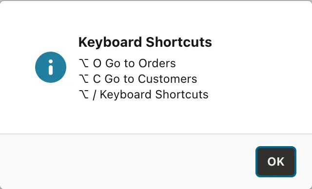
The slash key is written as it is, Alt+/. Key names such as Slash are not accepted, and an action with an invalid shortcut silently gets no shortcut at all, so listShortcuts does not list it. The dialog itself is apex.message.alert, covered in the guide to showing messages with apex.message.
Conclusion
An action is a named command with a label, state, and shortcut, and buttons, checkboxes, select lists, and menus bind to it through data-action, provided they exist before the action is added. add defines plain, toggle, and radio group actions, and invoke, get, set, and toggle use them. disable, enable, hide, show, and update change their state for every bound element at once, and observe reports changes. Shortcuts come from the shortcut property or addShortcut and are displayed with shortcutDisplay. apex.actions is the global context, createContext scopes actions to an element, and findContextById returns a widget's context, which is how you drive an interactive grid from your own buttons.
