
Charts in Oracle APEX are Oracle JET charts underneath, which means you get tooltips, hover effects, legends that hide and show series, zooming, keyboard access, and sensible behavior on a phone without doing anything about any of it.
What you do instead is write a query and set a few properties. This guide builds a sales dashboard with four charts: a combination of monthly revenue and order counts on two axes, a donut split by channel, a horizontal top-ten bar chart that drills down to the product, and a stacked chart of regions by quarter.
Which Chart Type to Use
| Type | Use it for |
|---|---|
| Bar | Comparing values across categories, vertical or horizontal, grouped or stacked |
| Line, Area, Line with Area | Trends over time or over an ordered category |
| Combination | Bars, lines, and areas together, such as revenue against order count |
| Pie, Donut | Shares of a whole, when there are few slices |
| Scatter, Bubble | Relationships between two or three measures |
| Range | Low and high values, such as a price band |
| Funnel, Pyramid | Stages of a process, such as a sales pipeline |
| Polar, Radar | Several measures arranged around a circle |
| Box Plot | The distribution of a set of values |
| Stock | Open, high, low, and close values over time |
| Status Meter Gauge | One value against a target, as a dial or a bar |
| Gantt | Tasks and their durations over time |
Most dashboards need three of these. Bars compare, lines show change, and a donut shows composition. If you find yourself reaching for a radar chart, it is worth asking whether a plain bar chart would communicate more. The status meter gauge is the exception that earns its place, because a single number against a target reads instantly.
How a Chart Region Is Put Together
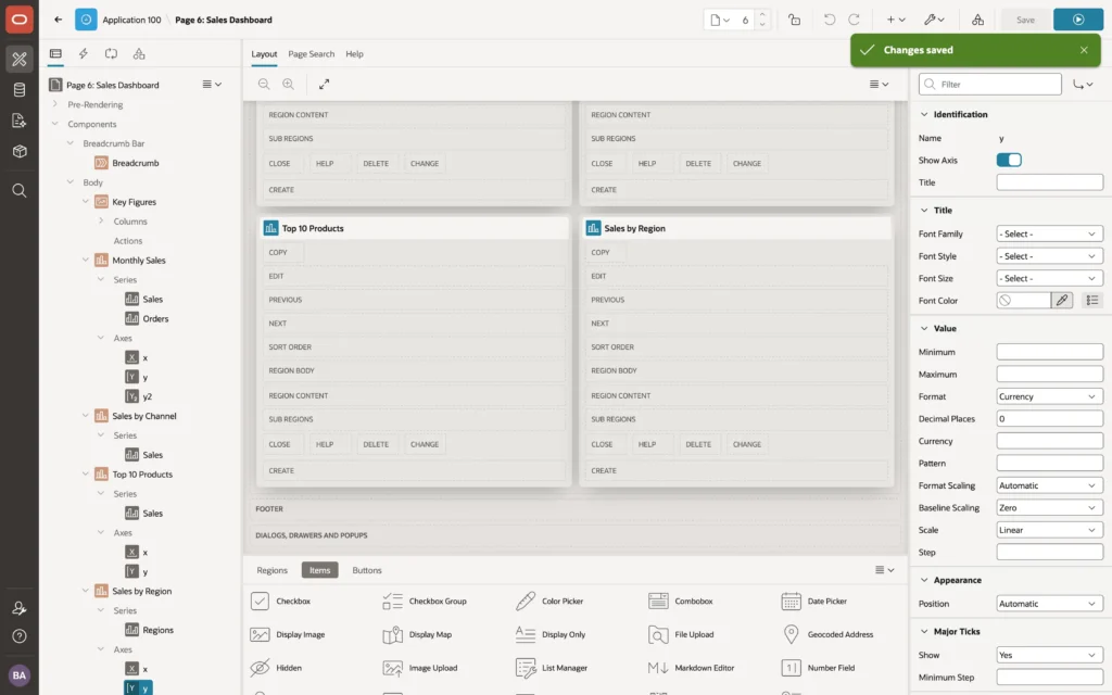
A chart region has two kinds of children, and understanding the split makes everything else easier.
Series carry the data. Each has its own source, which can be a query, a table, a REST source, or the region's source, and each maps columns to the chart's label, value, and optionally a series name and tooltip values. One chart can hold several series from entirely different queries.
Axes carry the presentation. The x and y axes, plus a second y-axis when you need one, each have a title, a format, a scale, and grid line settings. Pie, donut, funnel, and gauge charts have no axes at all.
The region's Attributes tab governs the chart as a whole: its type, orientation, stacking, height, animation, tooltips, legend, zooming, time axis, and the JavaScript initialization hook covered at the end.
Creating a Chart
- Right-click the region the chart should follow and choose Create Region Below.
- Give it a name and title and set Type to Chart. APEX adds a series and, for charts with axes, the x and y axes.
- On the Attributes tab, choose the chart type and its settings.
- Select the series, set its source type to SQL Query, paste your query, then pick the label and value columns. The lists populate as soon as the code editor closes.
Switch off Start New Row on alternate charts and they sit side by side, which is how you get a two-by-two dashboard without touching CSS.
select trunc(order_date, 'MM') as sales_month,
       sum(order_total)        as sales,
       count(*)                as orders
  from orb_orders
 where status <> 'CANCELLED'
   and order_date >= add_months(trunc(sysdate, 'MM'), -11)
 group by trunc(order_date, 'MM')
select p.product_id,
p.product_name,
sum(i.line_total) as sales
from orb_order_items i
join orb_orders o on o.order_id = i.order_id
join orb_products p on p.product_id = i.product_id
where o.status <> 'CANCELLED'
group by p.product_id, p.product_name
order by sales desc
fetch first 10 rows onlyNote that the top-ten query selects the product ID even though no one will see it. Link targets can use any column the series query returns, which is what makes drill-down possible later.
One Query, Many Series
A stacked chart of four regions across four quarters does not need four queries. Give the series a Series Name column, point it at the region column, and APEX creates one series per distinct value.
select region,
       to_char(sales_month, 'YYYY "Q"Q') as quarter,
       sum(sales_amount)                 as sales
  from orb_sales_by_month_v
 where sales_month >= add_months(trunc(sysdate, 'Q'), -9)
 group by region, to_char(sales_month, 'YYYY "Q"Q')
This is the right approach whenever the categories are data rather than design, because a new region appearing next quarter needs no change to the page. When your series are fixed and come from different queries, create a series node for each instead.
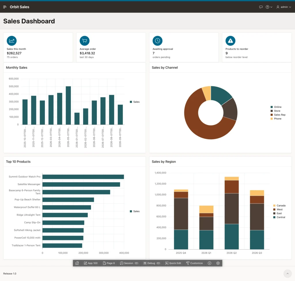
The first run is instructive. Three charts are already presentable, while the monthly chart shows long timestamps as labels, months in the wrong order, and bare numbers on the axis. Every one of those has a specific fix.
Time Axes and Ordering
A chart shows categories in whatever order the series hands them over, and the Sort Order attribute can re-sort by label or value. Dates need more than sorting, because January 2026 must sit after December 2025 rather than wherever the alphabet puts it.
- On the region's Attributes, set Time Axis Type to Enabled, so the x-axis treats the column as dates and spaces points by time.
- On the series, set Order By to a static value ordering by the date column.
- On the x-axis, set Format to a short date and give it a pattern such as MMM yy, following the Unicode date conventions where MMM is the short month name.
Time Axis Type has two other settings worth remembering: Mixed Frequency, for series whose points fall on different dates, and Skip Gaps, which closes weekend gaps in stock-style charts.
Formatting Axes
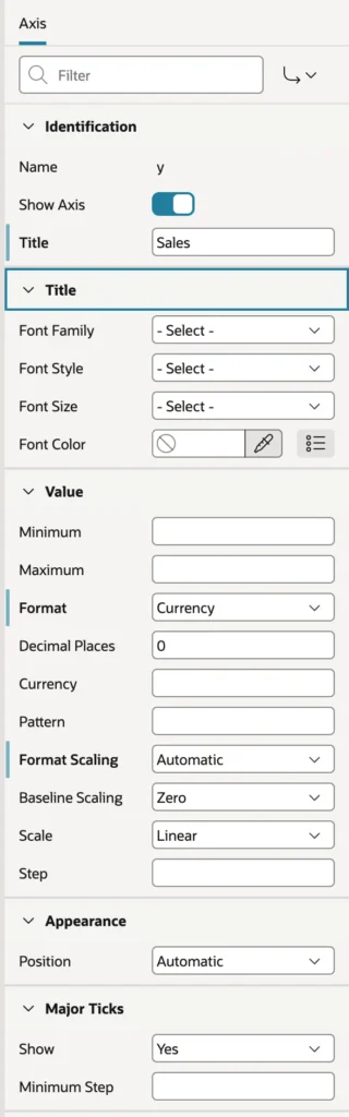
Give every value axis a title and a format. Currency is the one people forget, and it is the difference between a chart that reads and a column of anonymous numbers.
- Minimum, Maximum, and Step fix the scale rather than letting the chart choose.
- Decimal Places, Pattern, and Format Scaling control how values are written. With scaling set to Million, 1,200,000 appears as 1.2M.
- Baseline Scaling decides whether the axis starts at zero or at the lowest value, which changes how dramatic a trend looks. Starting at zero is the honest default.
- Scale switches between linear and logarithmic.
- Major and minor ticks, tick labels, and fonts handle the rest.
A Second Series on a Second Axis
Revenue and order counts belong together, but plotted on one axis the counts flatten into a line along the bottom while revenue fills the chart. A second y-axis fixes the mismatch.
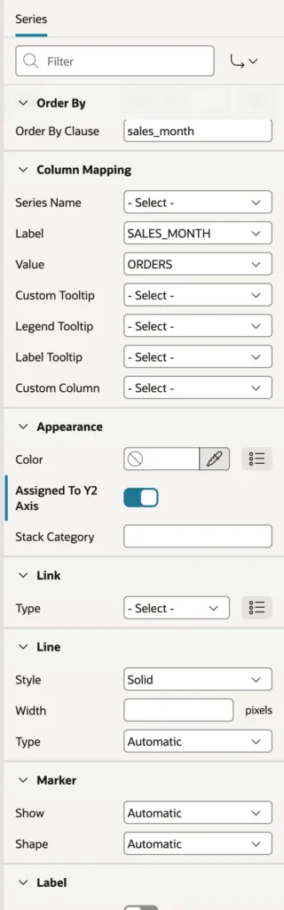
- Right-click Series under the chart and create a second series.
- Set its type to Line. In a combination chart each series picks its own rendering: bar, line, area, line with area, or a range variant.
- Use the same query and ordering, mapping the value to the count column.
- Switch on Assigned To Y2 Axis.
APEX adds a y2 axis, which you should title as carefully as the first. Two unlabeled axes are worse than one.
Data Labels
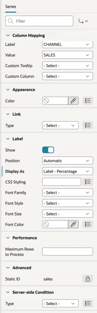
Pie and donut charts are hard to read without numbers on them, because people judge angles badly. Switch on the series label and choose what it displays, such as the label with its percentage. Position places labels inside or outside the slices, and for line charts above, below, or beside the markers.
Drill-Down Links
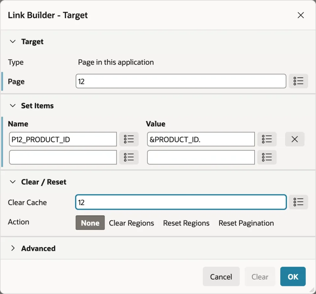
Set the series Link type to redirect to a page, then use the Link Builder to name the target page, pass the key column with a substitution, and clear the target page's cache. Now a bar is not just information, it is a route into the detail.
While you are there, switch off the legend on any chart with a single series. A legend explaining one color is pure furniture.
The Finished Dashboard
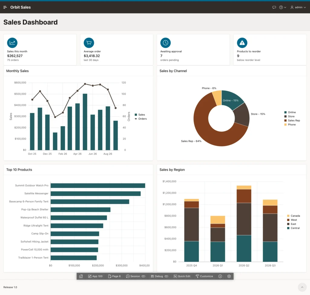
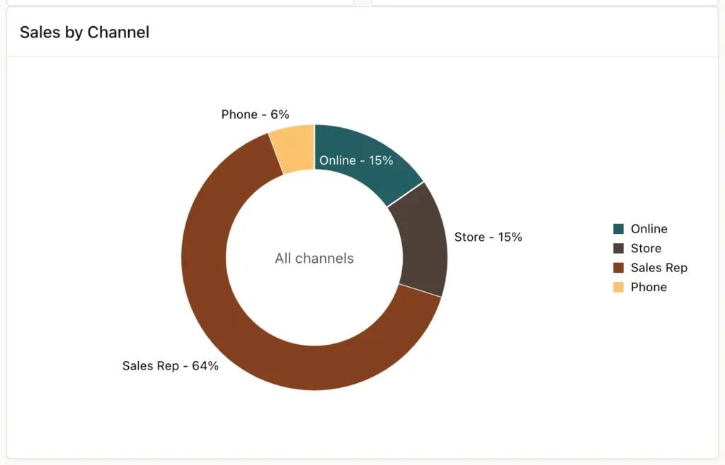
The monthly chart now shows revenue as bars and orders as a line against the right-hand axis, with months in order and currency on the left. The donut gives each channel's share with percentages, the top ten are ranked by revenue, and the stacked bars show what each region contributed per quarter.
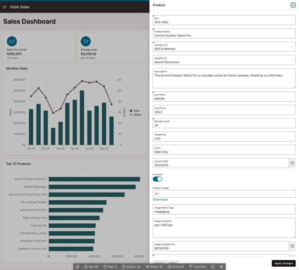
Everything interactive came free: hover for a tooltip with the series, label, and value, click a legend entry to hide a series, and click through to the record behind a bar.
Going Further with JavaScript
The declarative properties cover the great majority of what anyone needs. Beyond them, Oracle JET's chart has hundreds of options, and APEX exposes all of them through the region's Initialization JavaScript Function. APEX builds the options from your property settings, hands them to your function, and uses whatever you return.
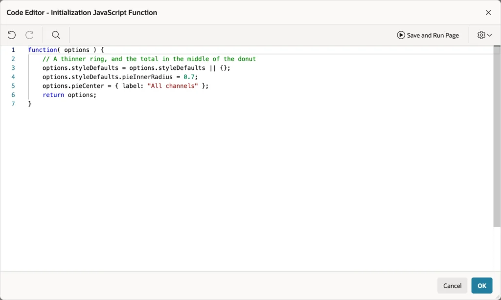
function( options ) {
    // A thinner ring, and the total in the middle of the donut
    options.styleDefaults = options.styleDefaults || {};
    options.styleDefaults.pieInnerRadius = 0.7;
    options.pieCenter = { label: "All channels" };
    return options;
}
The two rules are simple: change the options object you are given, and return it. Forgetting the return leaves you with a blank chart and no error, which is a five-minute mystery the first time it happens. The Oracle JET documentation for ojChart lists every option available, and series have declarative properties worth checking first, including Color, so cancelled orders can always be red.
Charts are regions, so a Refresh dynamic action redraws one when a user changes a date range or another item listed in the series' Page Items to Submit. The Animation on Data Change property decides how that redraw is animated.
Conclusion
An APEX chart is a query plus a handful of properties, and the structure underneath is always the same: series supply the data and map columns to labels and values, axes supply the titles, formats, and scales, and the region's attributes decide the type and overall behavior. A series name column turns one query into as many series as the data contains, which keeps a stacked chart correct when a new category appears, while separate series nodes combine different queries and, in a combination chart, different renderings. Time axes put dates in order and space them properly, a second y-axis rescues a measure that would otherwise flatten against a much larger one, data labels make pie and donut charts readable, and a series link turns a bar into a route to the record behind it. When the declarative properties run out, the initialization function hands you the full Oracle JET option set, as long as you remember to return it. Get the query right, label the axes, and the chart will do the rest.
