
Every page of every Oracle APEX application is built in one editor: Page Designer. Wizards are just a fast way to fill it. Whatever they generate, you refine here, and most pages you build from scratch you build here from the first region to the last button.
That makes Page Designer the single tool worth learning properly. This guide takes a full tour: the toolbar, the four trees, the Layout pane and gallery, the Property Editor, the code editor, messages, search, keyboard shortcuts, and the new APEXlang View in APEX 26.1. At the end you add a region to a page yourself.
Opening Page Designer
There are three ways in.
- On the application home page, click the name of the page.
- While running the application, click Page in the Developer Toolbar to edit the page you are looking at, or Quick Edit and then the component you want to change.
- From inside Page Designer, jump to another page with the page finder.
Open any page and Page Designer fills the browser window.
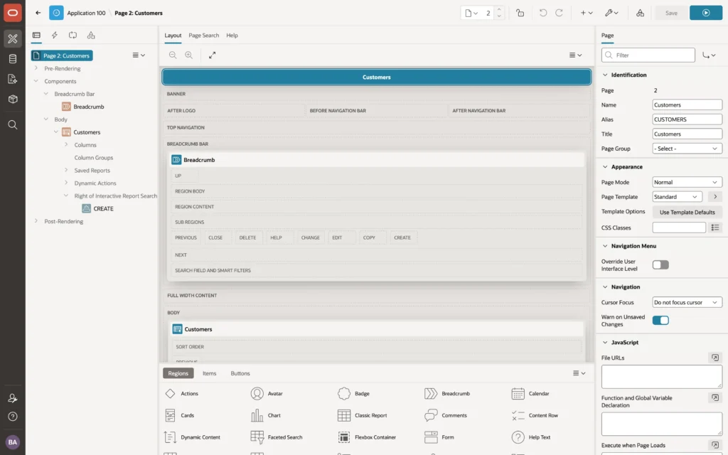
Page Designer shows a lot at once. It works on a laptop, but a large monitor makes it far more comfortable. If the panes feel cramped, zoom out in the browser and collapse the development environment's navigation bar.
The Parts of Page Designer
There is a toolbar across the top and three panes beneath it.
| Pane | Shows |
|---|---|
| Left | The page as four trees: rendering, dynamic actions, processing, and shared components |
| Center | The Layout of the page, the Gallery of components, Page Search, and Help |
| Right | The Property Editor, showing the properties of whatever is selected |
The three panes are connected. Select a component in any tree or in the Layout and it is selected everywhere, with its properties on the right. Drag the borders between panes to resize them.
The Toolbar

From left to right you get the back arrow, the application name, and the page name. Next is the page finder showing the current page number: type a number and press Enter to jump, use the arrows for the next or previous page, or click the page icon for the Page Finder dialog.
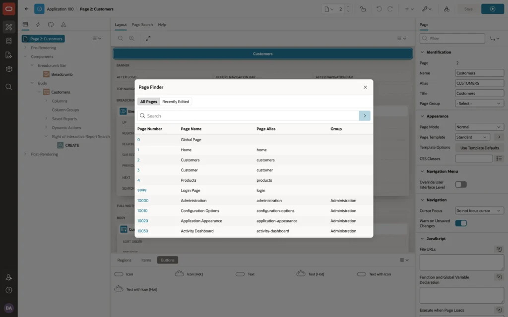
The rest of the toolbar covers the page as a whole.
- Show Messages appears when the page has errors or warnings, with their count.
- Lock stops other developers changing the page while you work on it. They see who holds the lock and why.
- Undo and Redo step through your recent changes.
- Create adds a page, copies this one, adds a breadcrumb region, creates a shared component or page group, or logs a developer comment.
- Utilities deletes the page, opens the APEXlang View, runs the Advisor, sets caching, shows the change history, exports the page, and controls the layout of Page Designer itself.
- Shared Components opens the application's shared components.
- Save stays disabled until you change something, and Save and Run Page saves and runs in the application's tab.
Page Designer keeps your changes in the browser until you save, and warns you if you try to leave with unsaved work. Save often, because Alt+F7 does it without touching the mouse.
The Rendering Tree
The first tab of the left pane lists everything displayed on the page, and everything that runs while it is displayed. It is the tab you use most.
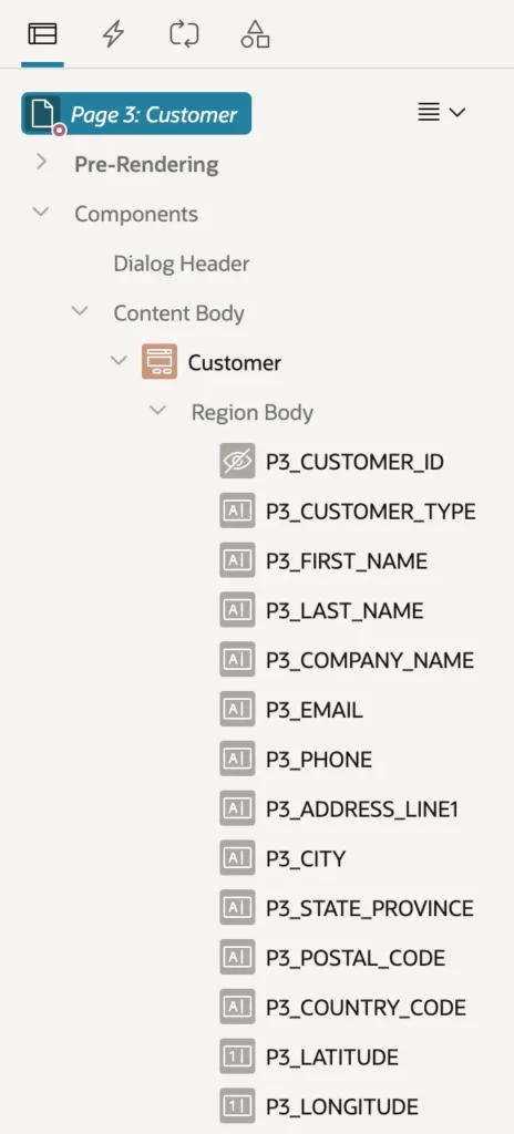
- Pre-Rendering holds processes and computations that run before APEX displays anything, such as the process that fetches a row into a form's items.
- Components holds the regions, items, and buttons, grouped by the slot of the page template they sit in, such as Breadcrumb Bar, Body, and Content Body.
- Post-Rendering holds processes, computations, and branches that run after the page is displayed.
Icons tell you what each node is. A red icon means an error. A name in italics means the component is conditional, shown only when a condition, an authorization, or a build option allows it, which is how server-side conditions show up in the tree.
The menu at the top right of the tree offers Expand All Below, Collapse All Below, and Comment Out. Display From Page and Display From Here switch between the whole page and just the branch below the selected node, which helps on large pages.
The Context Menu
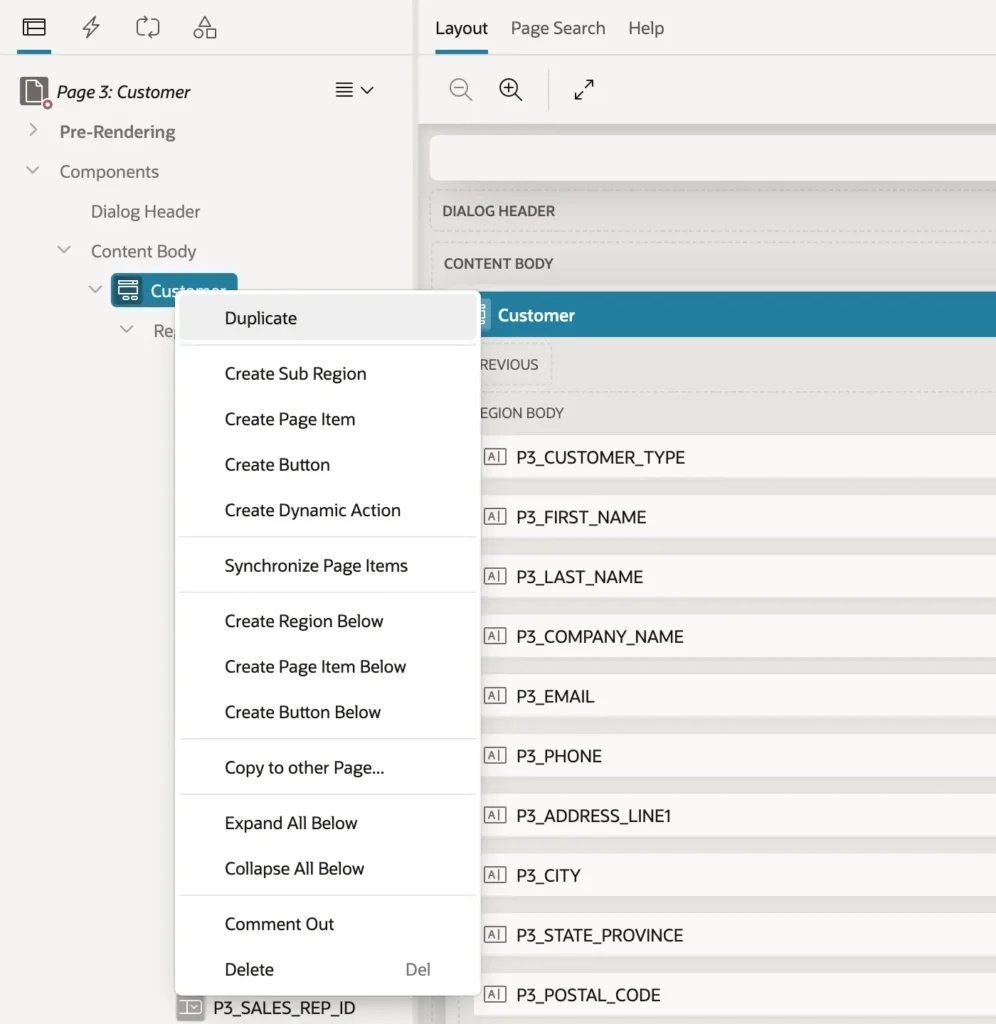
For a region you can duplicate it, create sub-regions, items, buttons, and dynamic actions inside it, copy it to another page, comment it out, or delete it.
Comment Out is worth knowing. It disables a component without deleting it, leaving it in the tree so you can bring it back. It is the Page Designer version of commenting out a line of code while you test something.
The Dynamic Actions Tree
The second tab lists the page's dynamic actions, grouped by the event that fires them: Page Load, Change, Click, Dialog Closed, and so on.
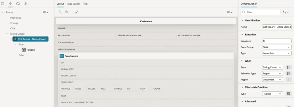
Dynamic actions make pages react in the browser without writing JavaScript. A report page generated by the wizard usually has one already: when the edit dialog closes, it runs a Refresh on the report region, so your changes appear at once. That pattern of refreshing a parent region is one you will use constantly.
The most common events are always listed, even when they have no dynamic actions, ready for you to right-click and create one.
The Processing Tree
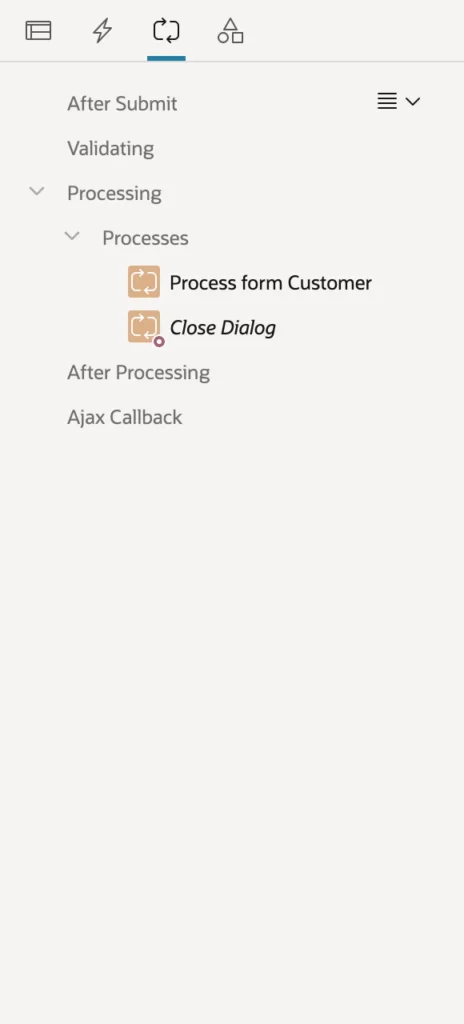
The third tab lists what happens when the page is submitted, in the order it happens.
| Branch | Runs |
|---|---|
| After Submit | Computations that run right after submission |
| Validating | Validations that check the submitted values |
| Processing | Processes that do the work, such as saving the form's row |
| After Processing | Branches that decide which page comes next |
| Ajax Callback | Processes the page calls from the browser without submitting |
On a generated form page you will see two processes: one that inserts, updates, or deletes the row, and one that closes the dialog afterwards. The second is usually in italics, because it runs only when certain buttons are pressed.
The Page Shared Components Tree
The fourth tab lists the shared components the page uses: the navigation menu, lists of values, authorization schemes, templates, and the rest.
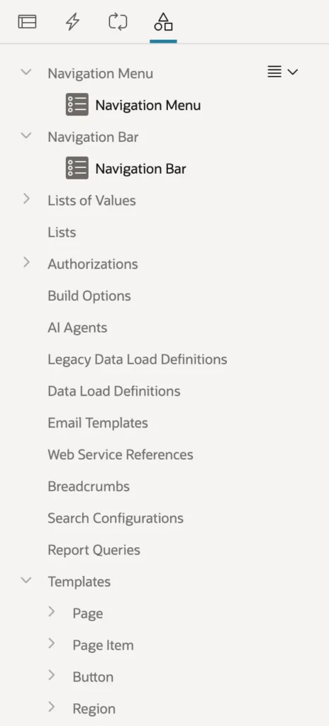
Select one to see its main properties, then click Edit Component at the top of the Property Editor to open it in Shared Components. This tab answers a question that comes up constantly, in reverse: if I change this list of values, which pages does it affect?
The Layout Pane and Gallery
The Layout tab shows the page as a grid of slots defined by the page template, such as Banner, Breadcrumb Bar, Full Width Content, and Body, with your regions placed in them. Inside each region you see the slots of the region's own template, into which items and buttons go.
The Layout is not a preview. It shows no data and no final styling, but it shows where everything goes, and it is where you place new components by dragging. The pane's toolbar zooms in and out and expands the pane to fill the window, and its menu hides empty slots, buttons, or items to cut clutter.
The Gallery
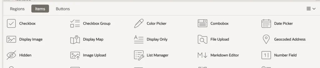
The Regions tab lists every region type, from Classic Report, Interactive Report, and Interactive Grid through Cards, Chart, Faceted Search, Map, Timeline, and Tree, plus any region plug-ins you install. The Items tab lists the thirty item types, from Checkbox to Textarea, including the date picker. The Buttons tab offers six styles: Icon, Text, and Text with Icon, each normal or hot.
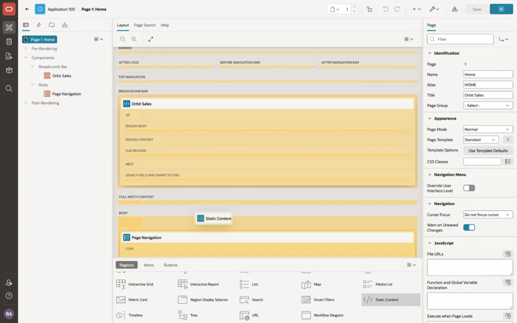
To add a component, drag it from the gallery into the Layout. Drop it, and it appears in the Layout and the tree, selected and ready for its properties.
If you prefer the keyboard, right-click a node in the Rendering tree and choose Create Region, Create Page Item, or Create Button. You can also right-click a component in the gallery and choose Add To.
The Property Editor
The right pane shows the properties of whatever is selected. Every setting of every component lives here, so this is where you spend most of your time once the components are in place.
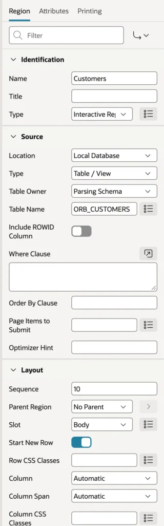
Properties sit in groups such as Identification, Source, Layout, Appearance, Advanced, Server-side Condition, and Security. Some components have more than one set, shown as tabs: an interactive report region has Region, Attributes, and Printing.
The editor shows only the properties that apply. Change a region's Type from Static Content to Classic Report and HTML Code disappears while SQL Query appears. Changing one property can reveal or hide others.
Two conventions help you read it. A red marker at the start of a label means the property is required. Buttons at the right of a field open helpers: a list of values, a code editor, a Quick Pick of common values, or a Go to arrow that opens the referenced component.
Finding Properties Fast
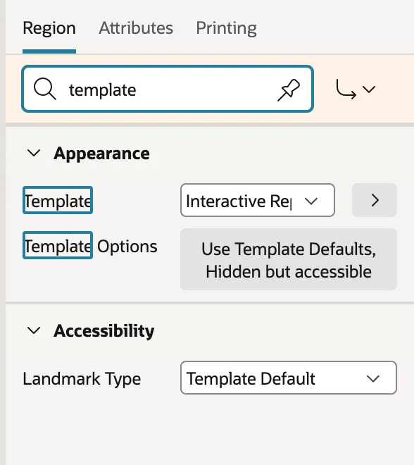
Regions and items have dozens of properties, so two tools matter. Filter, at the top of the pane, shows only properties whose names contain what you type. Type template and you see Template and Template Options and nothing else. The pin button keeps the filter as you select other components, which is ideal for changing the same property on several of them.
Go to Group, the arrow button beside the filter, jumps to a group, and Expand All reopens everything you collapsed.
Editing Several Components at Once
Select several components with Ctrl+click, or Cmd+click on a Mac, and the Property Editor shows what they have in common. Values that differ appear as Value Varies. Change one and it changes on all of them. This is the quickest way to give ten items the same width or the same template.
Getting Help on a Property
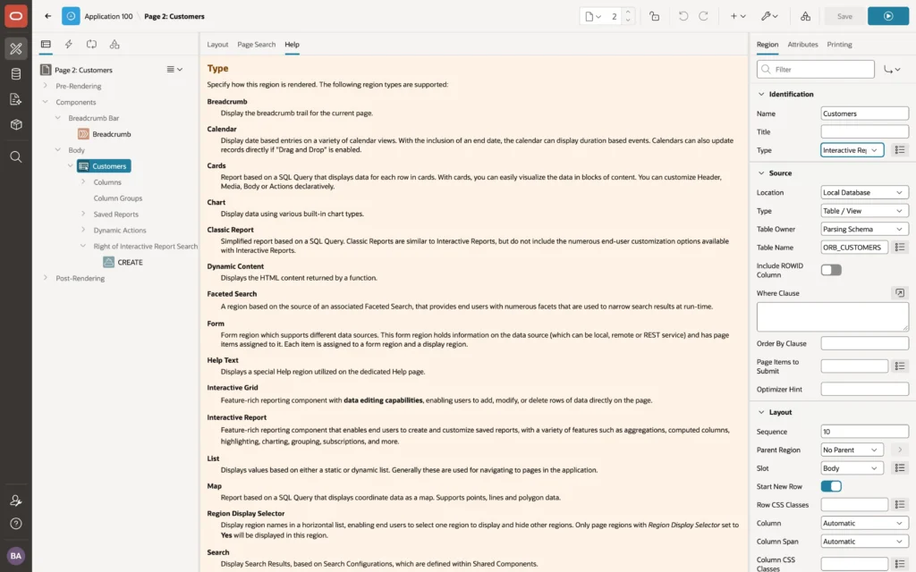
Click any property, then open the Help tab in the central pane, and you get the help for that exact property. It follows you as you move from property to property, so you can leave Help open while working through a region's settings.
"APEX's property help is precise, current, and full of examples. When you are unsure what a property does, read its help before searching the web."
The Code Editor
Properties that hold code can be edited in place, but for anything longer than a line, open the code editor with the button at the right of the property.
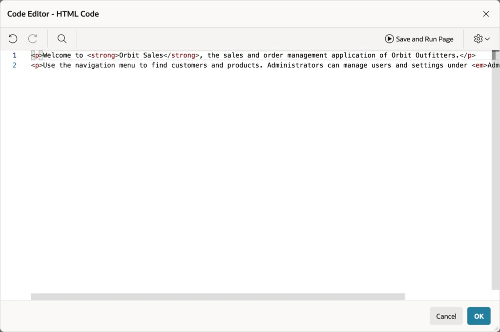
It is the same editor that powers SQL Workshop, with syntax highlighting, autocompletion on Ctrl+Space, and search and replace. For SQL and PL/SQL it adds Validate, which checks your code against the database, and for queries it adds Query Builder, which helps when you are building a function returning a SQL query.
Save and Run Page works from inside the dialog. The settings menu changes theme, font size, line numbers, and minimap. Click OK to put the code back into the property. It is also the place where you paste HTML and CSS snippets.
Messages: Errors and Warnings
Page Designer checks the page as you work. When a required property is missing, a query does not parse, or a column does not exist, it marks the component with a red icon, marks the offending property, and shows the error count in the toolbar.

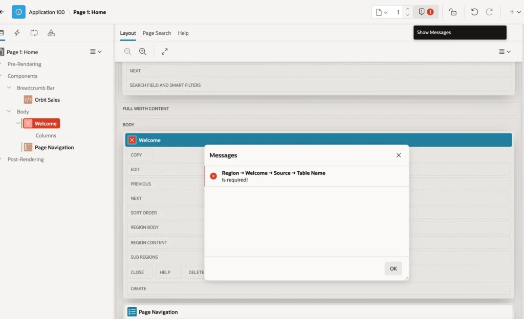
Each message shows a path, such as Region then Welcome then Source then Table Name, followed by the problem. Click a message to jump straight to that property.
You cannot save a page that has errors. Fix them or undo the change, and Save becomes available again. Warnings do not block saving, but read them anyway, because they often point at a performance or security problem.
Page Search
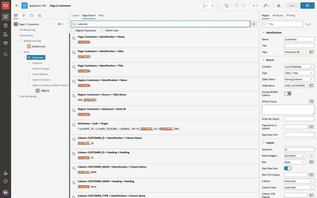
Page Search scans the whole page, every property of every component, for a string or a regular expression. Search a report page for customer and you find the page name and alias, the region, the table in its source, the link to the form page, and every column whose name or heading contains the word.
Click a result to select the component and highlight the property. This is how you answer questions like where does this page use this page item, which would otherwise mean opening component after component.
Arranging Page Designer
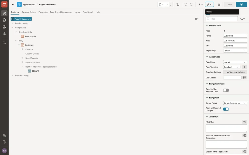
Page Designer remembers your pane sizes and the tabs you last used. Utilities then Layout offers Two Pane Mode, which moves Layout, Page Search, and Help into the left pane beside the trees. Many developers prefer it on smaller screens. Three Pane Mode switches back and Reset Layout restores the defaults.
Utilities then Show turns tooltips, the text messages picker, the global page components, and the Layout view on or off.
Keyboard Shortcuts
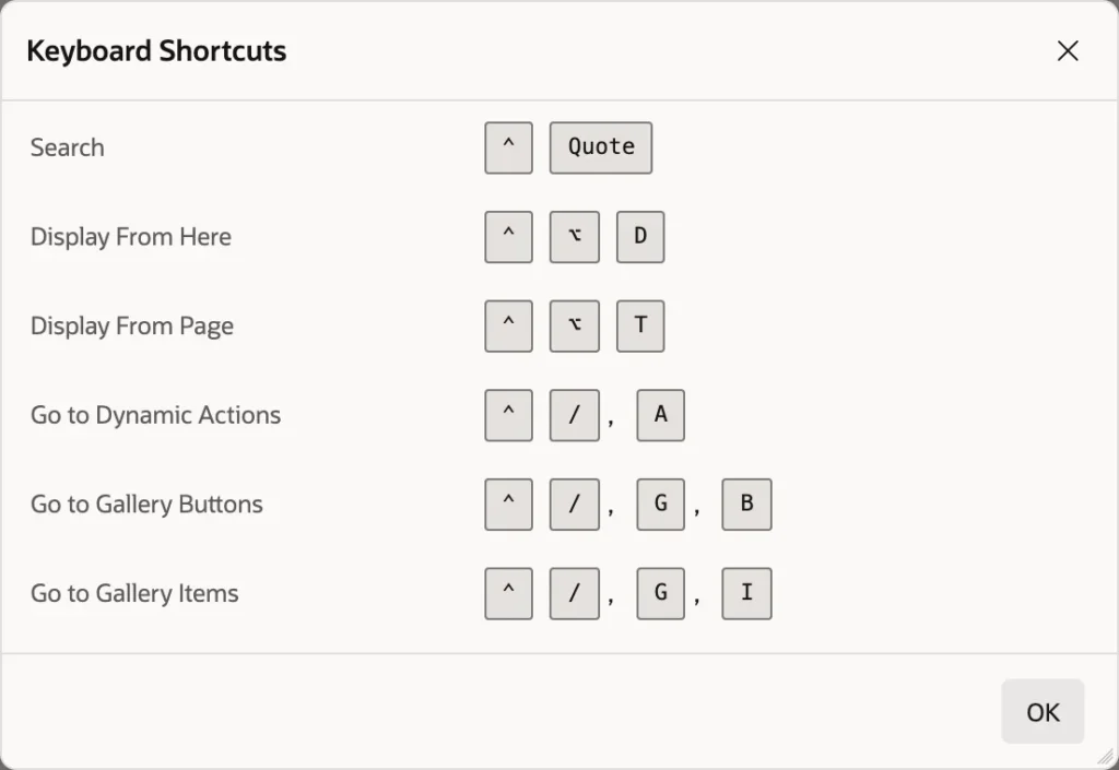
Most shortcuts are two steps: press Ctrl and slash, release, then press a letter to jump to a part of Page Designer. On a Mac, use Control and Option in place of Ctrl and Alt.
| Action | Shortcut |
|---|---|
| Save the page | Alt+F7 |
| Save and run the page | Alt+F8 |
| Next or previous page | Alt+Shift+Page Down or Page Up |
| Go to Rendering | Ctrl+/ then R |
| Go to Dynamic Actions | Ctrl+/ then A |
| Go to Processing | Ctrl+/ then P |
| Go to Page Shared Components | Ctrl+/ then S |
| Go to Layout | Ctrl+/ then L |
| Go to Page Search | Ctrl+/ then F |
| Go to Messages | Ctrl+/ then M |
| Go to the Property Editor | Ctrl+/ then E, M |
| Go to the gallery tabs | Ctrl+/ then G, then R, I, or B |
| Hide or show empty slots | Ctrl+Alt+E |
| Expand or restore the current pane | Alt+F11 |
| Keyboard Shortcuts | Alt+Shift+F1 |
In the trees, arrow keys move between nodes and expand branches, Delete removes the selected components, and Shift+F10 opens the context menu.
The APEXlang View in APEX 26.1
APEX 26.1 introduces APEXlang, a readable text format for applications. An application exported as APEXlang is a set of plain-text files that people can read, compare in source control, and review in pull requests, and that AI coding assistants can read and write.
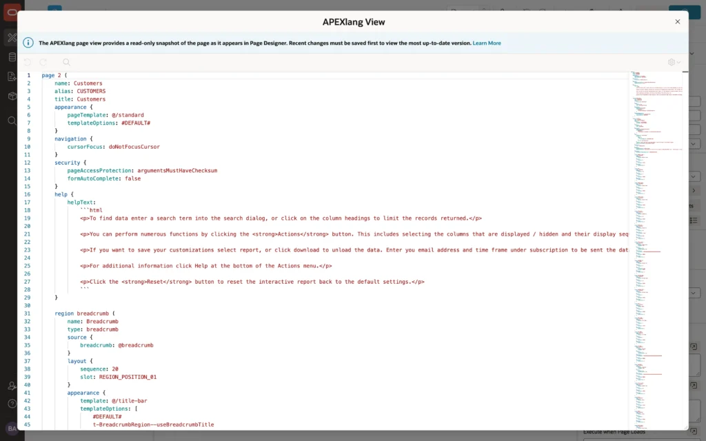
The view is read-only and shows the saved page, so save before opening it. Even if you never export an application this way, it is useful: it lists every property that differs from its default, for every component, on one scrollable page. That makes it a fast way to review what a page does, compare two pages, or copy a component's settings into a note.
Hands-On: Add a Welcome Region
Time to change something. You will add a welcome message to the top of a home page.
- Open page 1 in Page Designer by typing 1 into the page finder and pressing Enter.
- In the gallery, open the Regions tab and find Static Content, the simplest region there is.
- Drag Static Content into the Layout and drop it inside Body, above the navigation region. It appears in the tree as New, selected.
- In the Property Editor, set Identification then Name to Welcome, and Title to Welcome. The name identifies the region in Page Designer, and the title is the heading users see.
- Under Source, open the code editor next to HTML Code and type your message, then click OK.
- Click Save. A Changes saved message confirms it.
- Click Save and Run Page to see it.
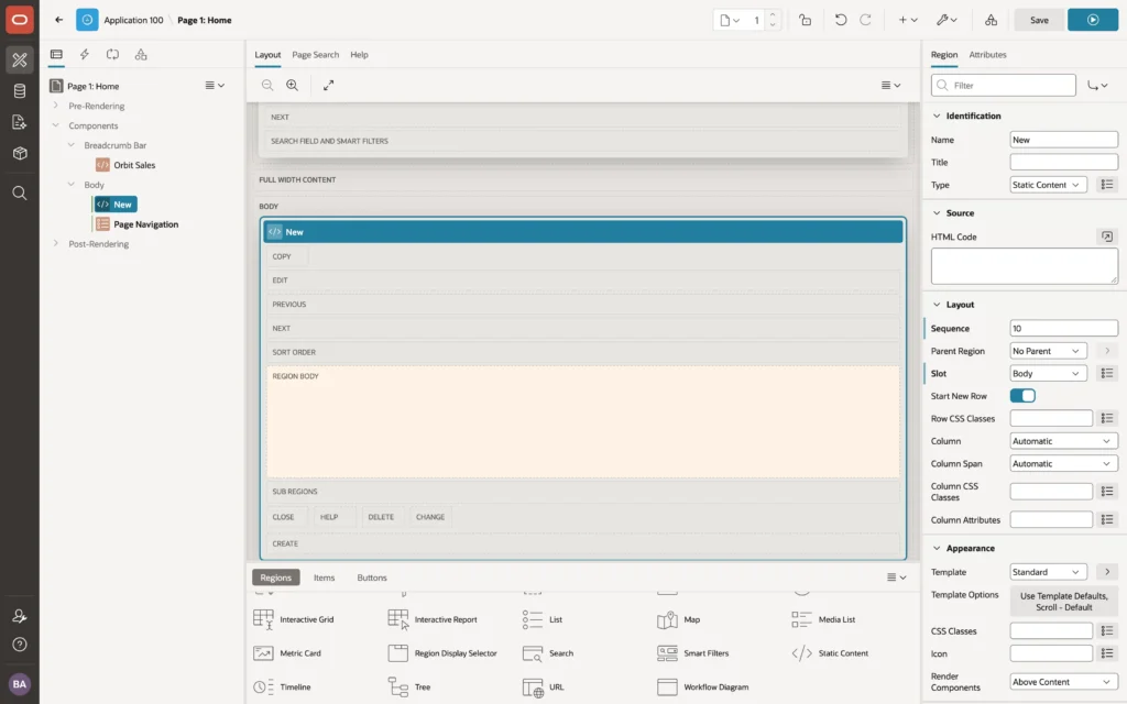
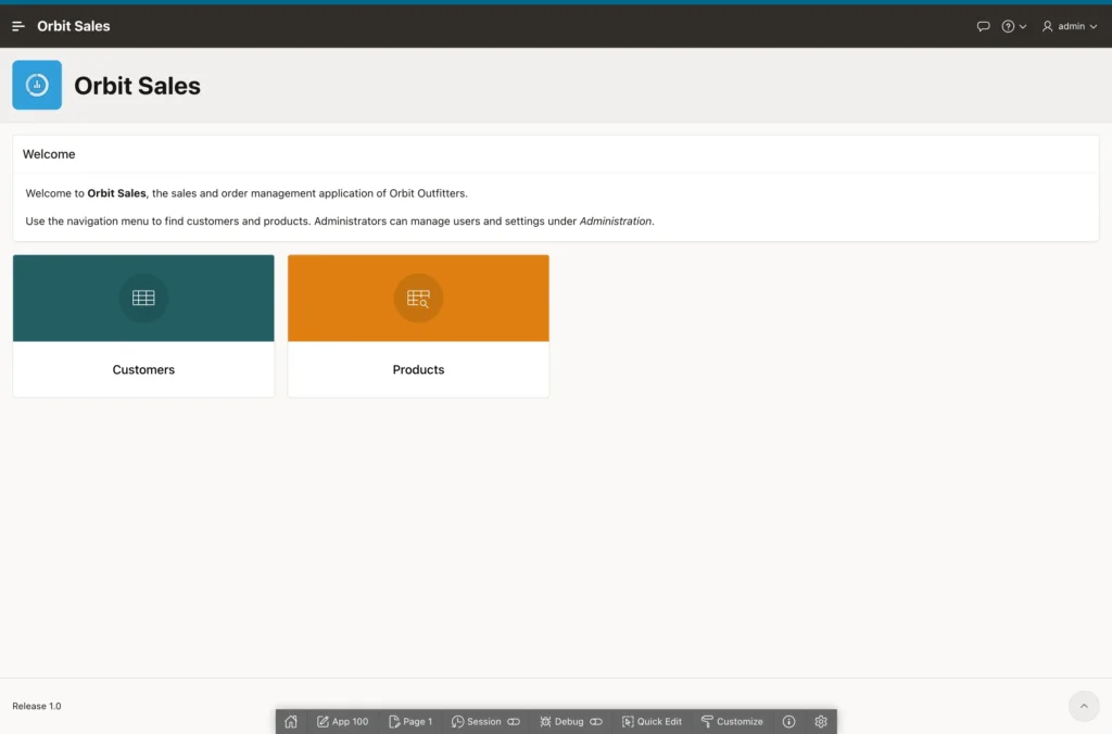
Now break it on purpose. Select the Welcome region and change its Type to Classic Report. The icon turns red, the toolbar reports one error, and Show Messages tells you Table Name is required, because a classic report needs a source and static content does not. Click Undo, and notice your HTML is still there.
Where you drop a component sets its Layout Slot and Sequence properties. If the region lands below the navigation instead of above it, drag it again or give it a lower sequence number, because components in the same slot appear in sequence order.
Conclusion
Page Designer is where you build and refine every APEX page, and knowing it well pays back every hour you spend on it. The toolbar saves, runs, locks, and moves between pages. The left pane shows the page as four trees: Rendering for what is displayed, Dynamic Actions for what happens in the browser, Processing for what happens on submit, and Page Shared Components for what the page borrows from the application. The central pane holds the Layout you drag components onto, the gallery they come from, Page Search, and context-sensitive Help, while the Property Editor on the right exposes every setting with a filter, code editors, and quick picks to find them. Page Designer checks your work as you go, refuses to save a page with errors, can be driven almost entirely from the keyboard, rearranges into two panes on smaller screens, and in APEX 26.1 shows any saved page as readable APEXlang text. Learn the trees first, then the Property Editor filter and the keyboard shortcuts, and the editor stops being busy and starts being fast.
