
Some data only makes sense in a particular shape. Store locations belong on a map, delivery dates belong on a calendar, and product categories belong in a tree. Force any of them into a table and your users will do the translation in their heads, badly.
Oracle APEX has a region for each shape, and none of them needs JavaScript to get going. This guide builds three pages: a map of stores over a heat map of customers, a delivery calendar colored by order status, and a category tree with products hanging beneath it.
Maps
The Map region draws a background map and stacks layers of data on top: points, lines, polygons, heat maps, or extruded 3-D shapes. The location data can come from an SDO_GEOMETRY column, a GeoJSON column, or simply two number columns holding longitude and latitude, which is what most tables already have.
Creating a Map Page
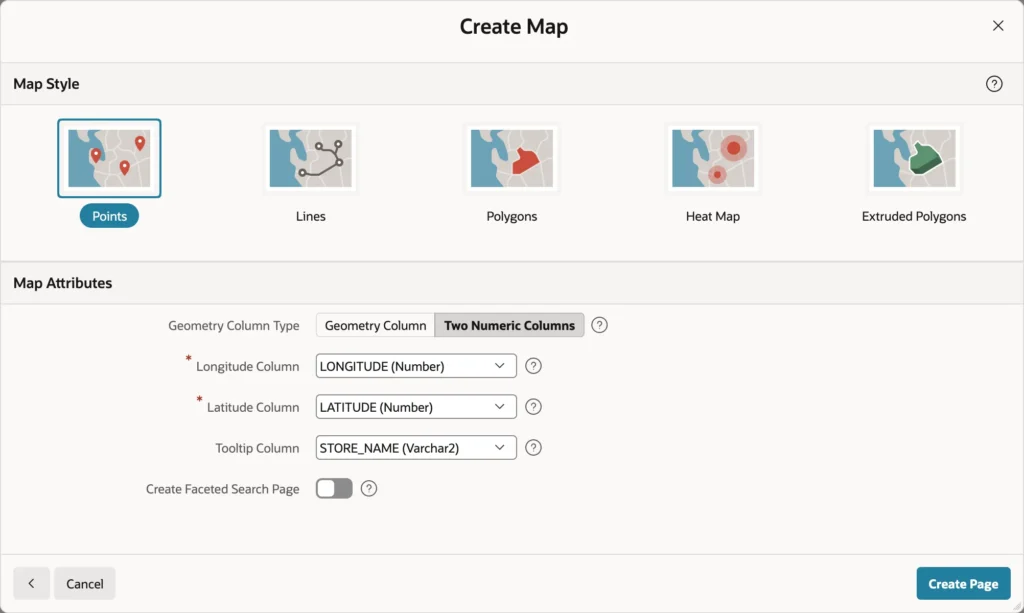
- Click Create Page, then Map.
- Name the page, choose your table, and pick an icon.
- Keep Layer Type as Points, choose Two Numeric Columns, and name the longitude and latitude columns.
- Pick a tooltip column and click Create Page.
That is enough for a working map: pins in the right places, tooltips on hover, zoom and pan with the mouse or by touch. One caveat worth knowing before a demo goes wrong: the default background map comes from Oracle's online map service, so it needs internet access. On an intranet, set the region's Background property to a built-in style or to a map background you define under Shared Components, such as your own tile server.
Map Attributes
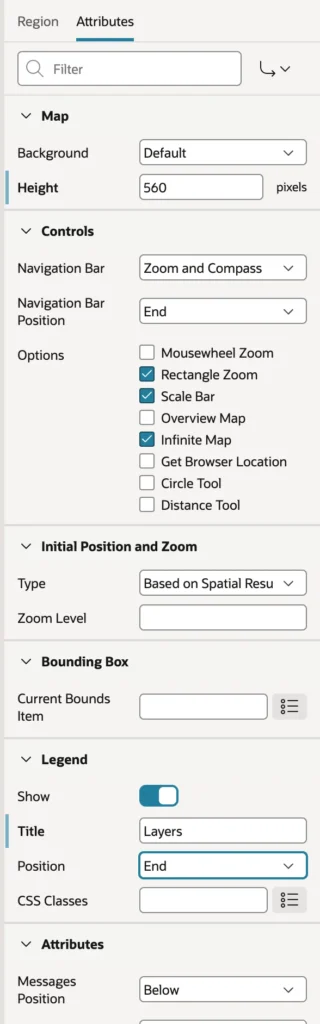
- Height sets how tall the map is, in pixels. The default is usually too short to be useful.
- Controls turn on the navigation bar, mousewheel zoom, rectangle zoom, the scale bar, an overview map, the browser's location, and measuring tools.
- Initial Position and Zoom can fit the map to the data, which is almost always what you want, or start somewhere fixed.
- Current Bounds Item hands the visible area to a page item, so a report beside the map can list only what is on screen.
- Legend shows the layer list, with a title, so users can switch layers off.
Styling Points and Adding an Info Window
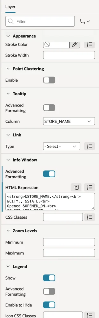
Open the layer the wizard created and give it a name and a primary key column. Point Objects chooses between an SVG shape, such as a pin, circle, or square, drawn in your colors, and a Font APEX icon. Shape Scale makes pins bigger, and the Appearance group sets fill color, stroke, and opacity, which is where your brand color goes.
Point Clustering deserves a note. With it on, nearby points merge into one circle showing a count until the user zooms in. For a dozen stores it is unnecessary. For ten thousand customers it is the difference between a map and a blob.
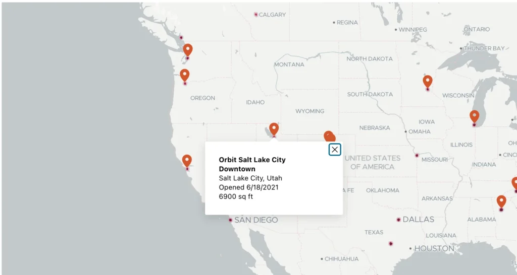
Tooltip and Info Window are easy to confuse. The tooltip appears on hover and should be short, usually one column. The info window appears on click and can hold formatted HTML, so it is where the useful detail goes.
<strong>&STORE_NAME.</strong><br>
&CITY., &STATE.<br>
Opened &OPENED_ON.<br>
&FLOOR_AREA_SQFT. sq ft
A layer can also carry a Link, so clicking a point opens a page instead of an info window, and Zoom Levels can restrict a layer to a range of zoom, which keeps detailed layers from appearing until someone zooms in far enough to want them.
Adding a Heat Map Layer
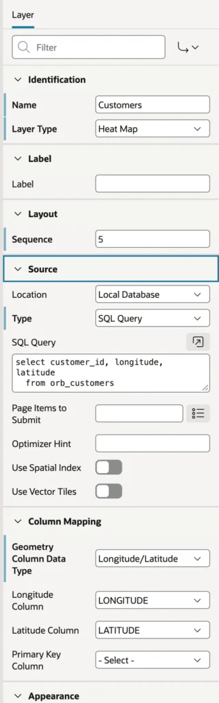
Pins answer "where are my stores". A heat map answers "where are my customers", which is a different and often more interesting question. Create a second layer, set its type to Heat Map, give it a query with the key and coordinates, and map the geometry columns as before.
select customer_id, longitude, latitude
  from orb_customers
Give the heat layer a lower sequence number than the pins so it draws underneath, then choose a color scheme and the glow radius under Appearance. Sequence is the whole trick to readable layering.
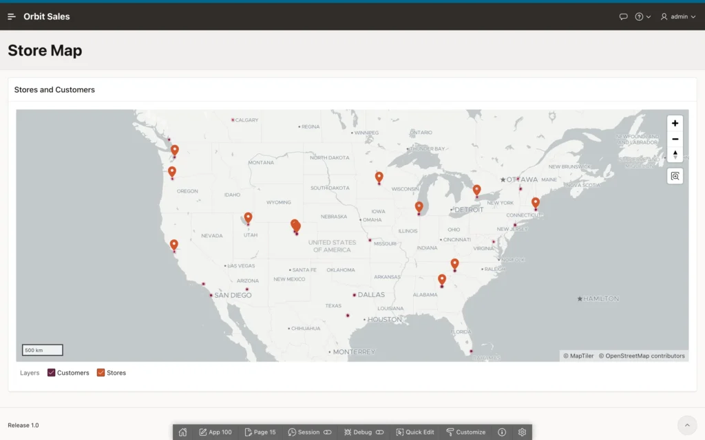
APEX 26.1 adds several things to maps worth knowing about: dynamic substitutions in layer properties, a bounding box setting, custom legends, vector tile layers that stream large spatial data sets efficiently from the database, and JavaScript functions to show, hide, and reorder layers at runtime.
Calendars
The Calendar region places rows on a monthly, weekly, daily, or list calendar. Each row needs one date, and a second date turns an event into something that spans days.
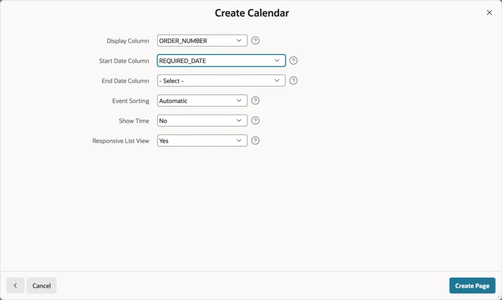
A delivery calendar is a good example, because a warehouse team cares about what must go out and when, and a date column in a report does not communicate that at all.
Coloring and Linking Events
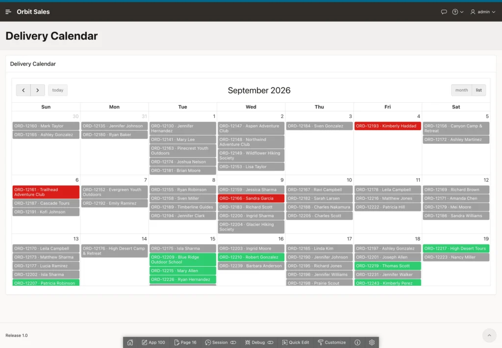
The generated calendar works but looks flat. Replace its source with a query that builds a readable title and, more importantly, assigns a CSS class per status.
select order_id,
       order_number || ' · ' || customer_name as title,
       required_date,
       status_label,
       case status
         when 'PENDING_APPROVAL' then 'apex-cal-yellow'
         when 'APPROVED'         then 'apex-cal-blue'
         when 'SHIPPED'          then 'apex-cal-green'
         when 'DELIVERED'        then 'apex-cal-gray'
         when 'CANCELLED'        then 'apex-cal-red'
         else                         'apex-cal-orange'
       end as css_class
  from orb_orders_v
 where required_date is not null
APEX ships a set of calendar classes for exactly this, in black, blue, bluesky, brown, cyan, darkblue, gray, green, lime, orange, red, silver, white, and yellow. Your own classes work too, but the built-in ones already match the theme.
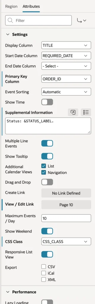
On the Attributes tab, map the display column, the start date, and the primary key, then point CSS Class at the class column. Supplemental Information adds a line to the tooltip and the list view, which is where a status label belongs. Finally set the View or Edit Link to your form page, passing the key and clearing the cache.
The remaining attributes cover the interactions people ask for next: a Create Link that opens a page when someone clicks an empty day, drag and drop with PL/SQL that saves the new date, Show Time for events with times, extra list and navigation views, and export to CSV, iCal, or XML.
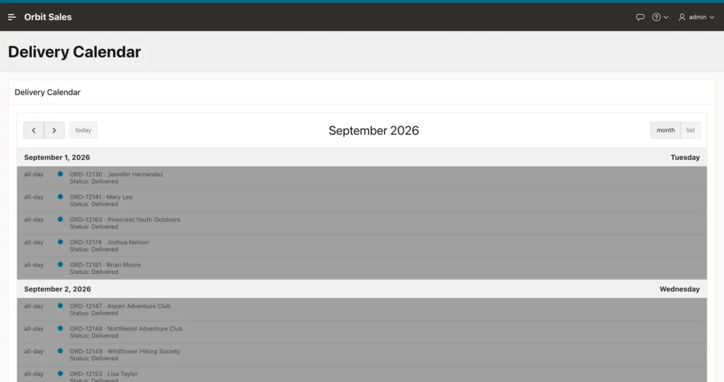
That last point matters more than it sounds. With Responsive List View on, a phone gets the list rather than a squeezed month grid, so the page stays usable without a second design.
Trees
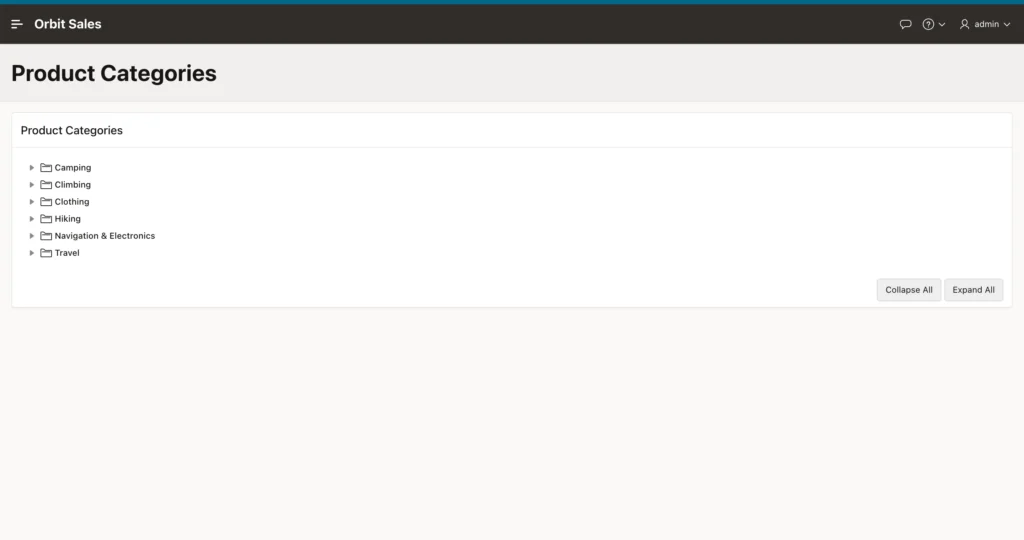
The Tree region renders hierarchical data: organization charts, bills of materials, folder structures, or product categories with subcategories.
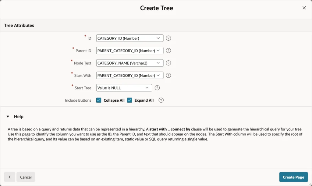
Give the wizard the ID column, the parent ID column, and the node text, then set Start With to the parent column and Start Tree to Value is NULL, so the tree begins at the roots. Add the collapse and expand buttons while you are there.
What the wizard writes for you is an ordinary hierarchical query, and its column list is the contract every tree query must honor: a status of 0 for a leaf, 1 for an expanded node, and -1 for a collapsed one, then the level, and then the node's title, icon, value, tooltip, and link.
Putting Real Content in the Tree
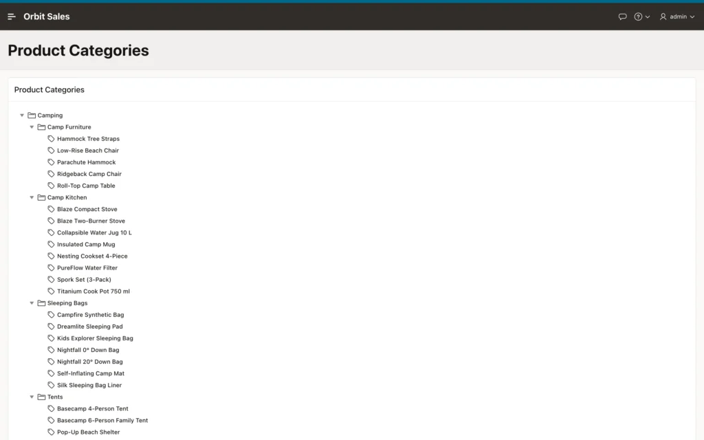
A tree of categories alone is not worth a page. It gets useful when the things inside those categories appear too, which means unioning two sets of nodes and giving each a unique ID, prefixed so a category and a product can never collide.
with nodes as (
    select 'C' || category_id                               as id,
           nvl2(parent_category_id, 'C' || parent_category_id, null) as parent_id,
           category_name                                    as title,
           'fa-folder-o'                                    as icon,
           null                                             as link,
           category_name                                    as sort_key
      from orb_categories
    union all
    select 'P' || product_id,
           'C' || category_id,
           product_name,
           'fa-tag',
           apex_page.get_url(p_page   => 12,
                             p_items  => 'P12_PRODUCT_ID',
                             p_values => product_id),
           product_name
      from orb_products
)
select case when connect_by_isleaf = 1 then 0
            when level = 1             then 1
            else                            -1
       end         as status,
       level,
       title,
       icon,
       id          as value,
       title       as tooltip,
       link
  from nodes
 start with parent_id is null
 connect by prior id = parent_id
 order siblings by sort_key
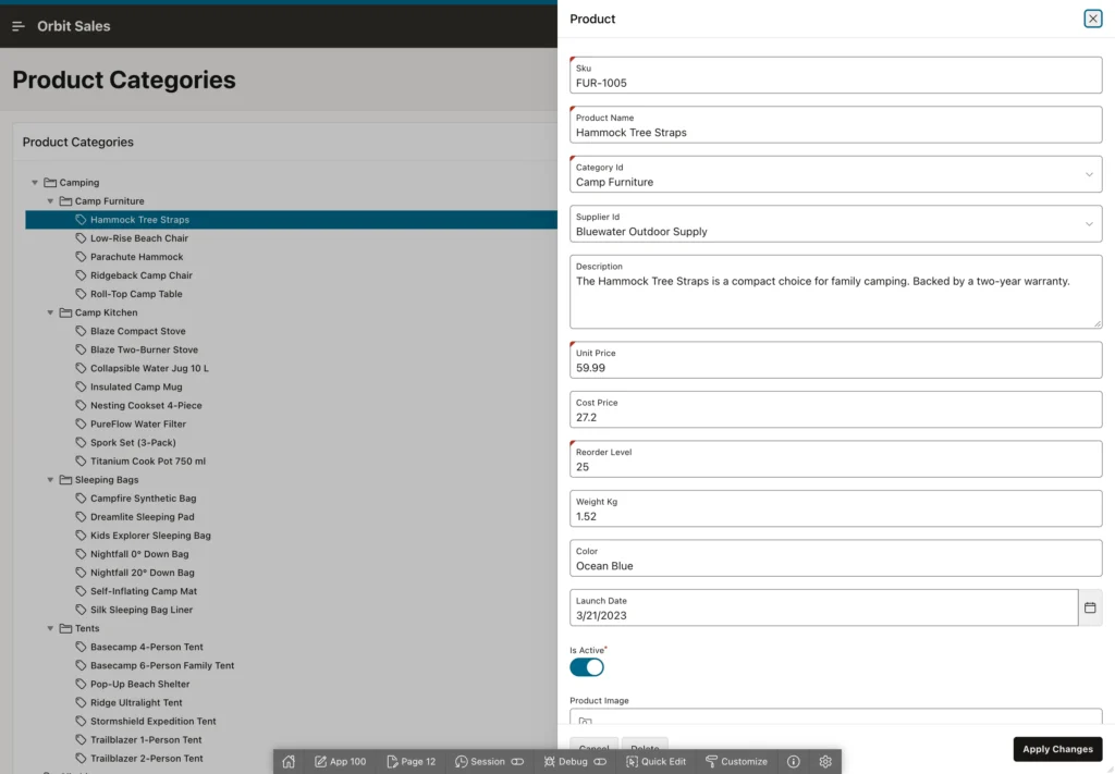
Two details carry this query. The prefixed IDs keep the two node types apart in one hierarchy, and apex_page.get_url builds each product link properly, including the checksum that a page with access protection requires. Hand-assembling that URL is how people end up debugging checksum errors.
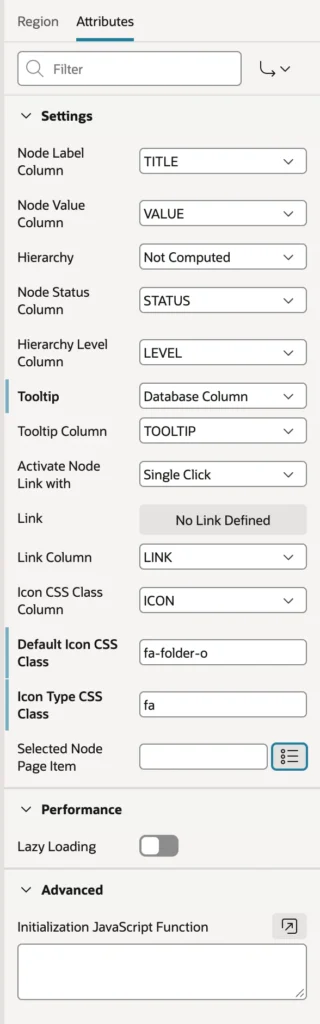
Set the icon type to the Font APEX prefix with a default icon class, point the tooltip at your tooltip column, and decide whether a single or double click follows a link. Selected Node Page Item is the one to remember for later: it receives the value of whatever node the user picks, which is how a tree drives a report beside it.
Gantt Charts
A Gantt chart shows tasks as bars along a time line, grouped into rows, which suits project plans, bookings, and campaign schedules. It is not a region of its own: create a chart region and set its type to Gantt.
Its series maps more columns than an ordinary chart. The Timeline group sets the start and end of the whole time line, from columns or page items. Column Mapping needs a row ID and row name to group tasks into rows, then a task ID, name, start date, and end date, with optional progress and baseline dates for comparing planned against actual. Viewport sets the slice of time shown first, leaving the rest to scrolling.
As with any chart, an initialization JavaScript function opens up the full Oracle JET Gantt component, including dependencies between tasks.
Conclusion
These three regions turn shapes of data that tables handle poorly into pages people read at a glance. A map draws layers over a background, taking locations from spatial geometries, GeoJSON, or plain longitude and latitude columns, with styled points, tooltips for a quick look, info windows for detail, clustering when the volume demands it, and a heat map underneath to show density rather than position. A calendar places rows by date, takes its colors from a CSS class your query calculates, links each event to its record, and falls back to a list view on small screens. A tree renders a hierarchical query whose status, level, title, icon, value, tooltip, and link columns form a contract, and a union with prefixed IDs lets you hang real records under their categories with properly built links. Gantt charts round out the set for work that happens over time. Choose the shape that matches the question your users are asking, and most of the explaining is done before they read anything.
